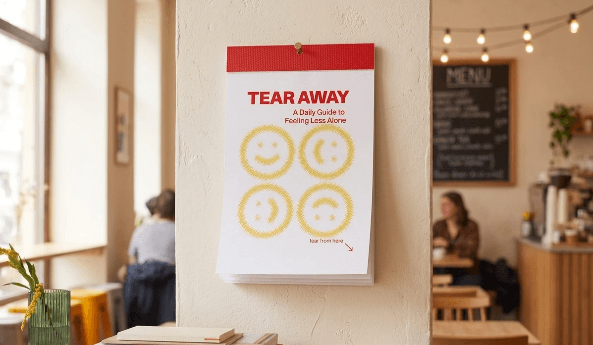
A daily guide to feeling less alone
How might we design an accessible, structured tool to help young adults navigate loneliness?
Tear Away is a 30-day tear-away workbook of daily, actionable exercises grounded in research on effective coping strategies — one page per day, physical and screen-free, with a low barrier to start.
Young adults navigating post-grad life in big cities are losing the social structures that once held them
We focused on the emotional wellbeing of young adults (22–27) navigating life transitions in urban environments — a group losing the built-in social structures of university life. Loneliness here isn't physical isolation, it's emotional disconnection: feeling invisible, misunderstood, or out of sync. When wellbeing dips, self-blame and withdrawal create a self-reinforcing spiral.
We grounded the design in academic research before designing anything
Secondary research
We reviewed academic papers on loneliness, wellbeing, and coping mechanisms. Three findings shaped our direction:
- Loneliness in young adults is driven by internal processes — rumination, self-blame, negative past orientation — more than physical isolation.
- The quality of social connection matters far more than the quantity.
- Effective coping means solution-focused action and positive reframing, not simply spending more time with people.
Primary research
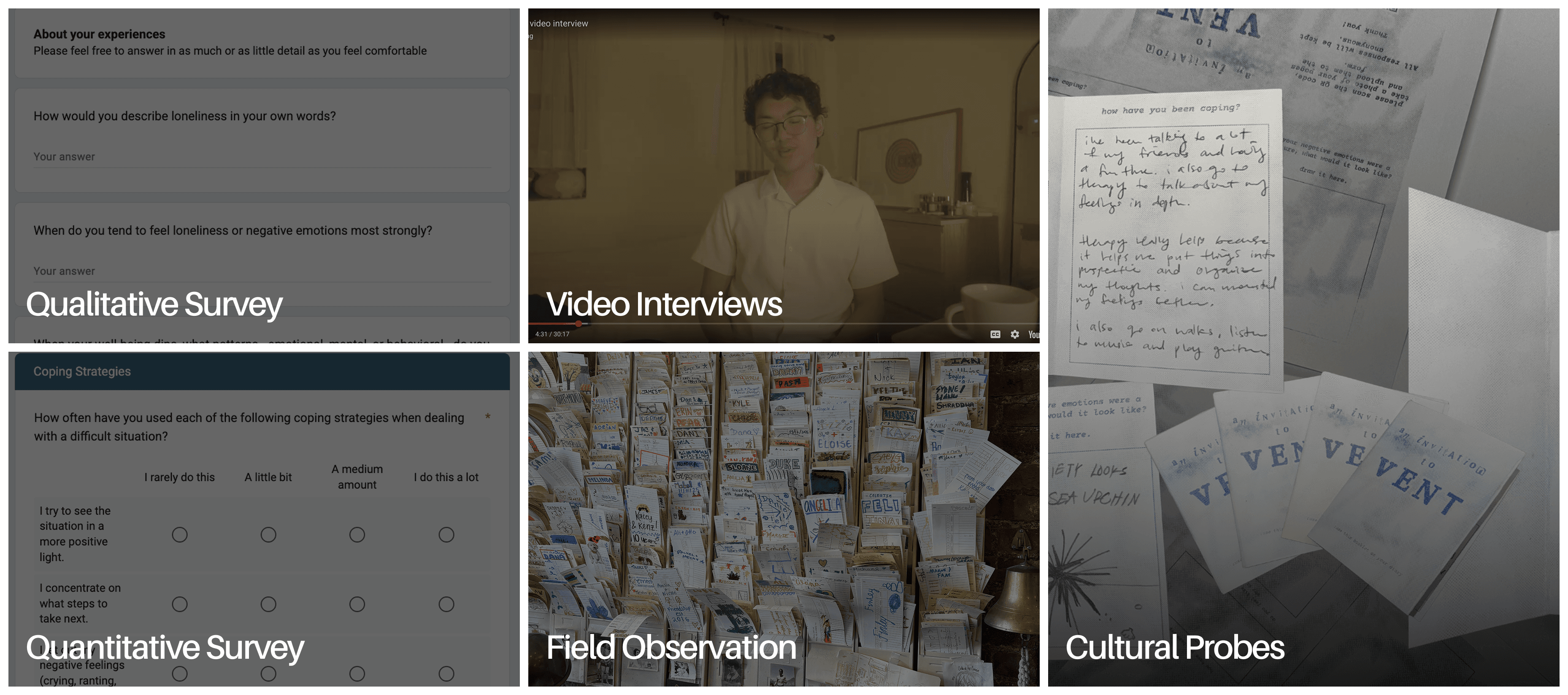
We narrowed our focus to recent graduates aged 22–27: navigating adult life for the first time, losing the built-in social structures of university, and a group we knew firsthand. We designed a series of mixed-method, quantitative and qualitative studies to better understand their experience.
People already knew what helped — they just weren't doing it
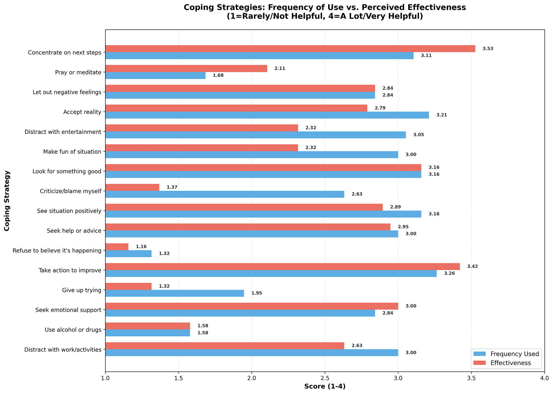
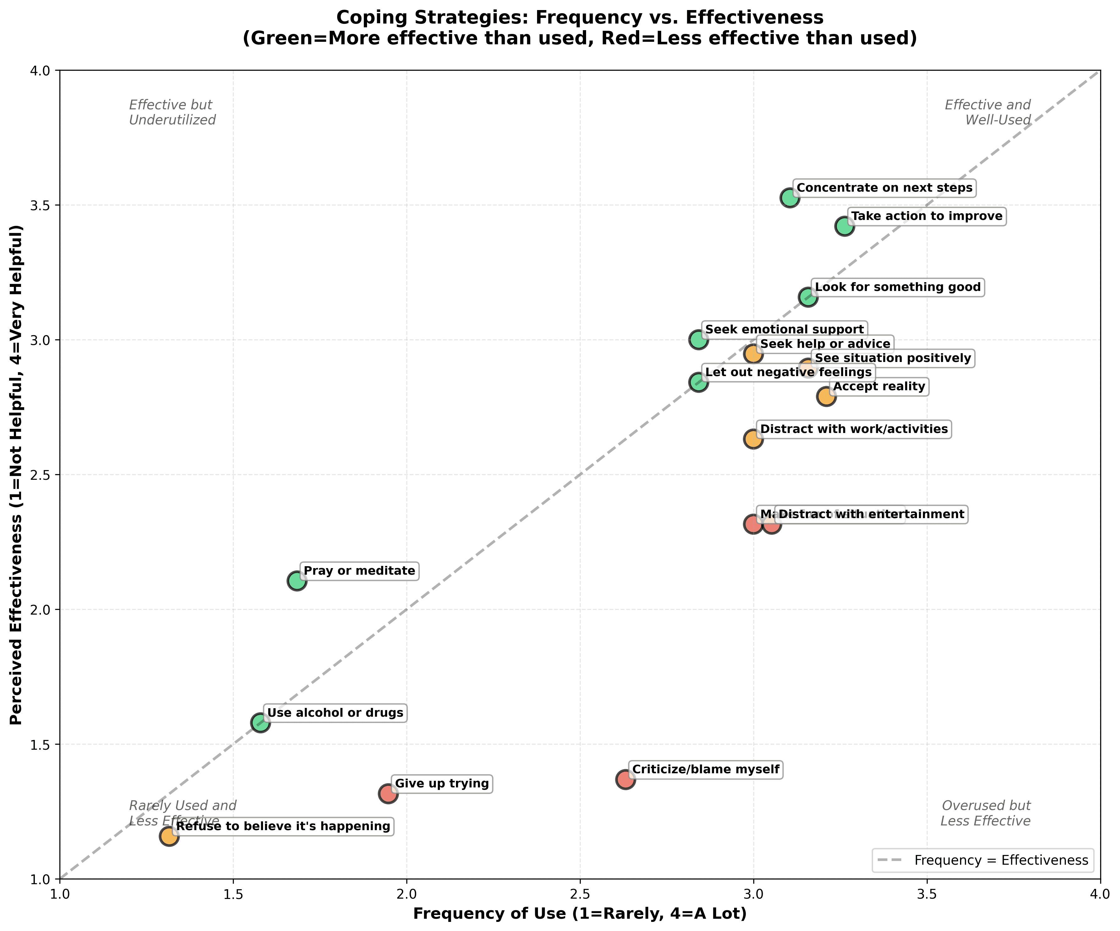
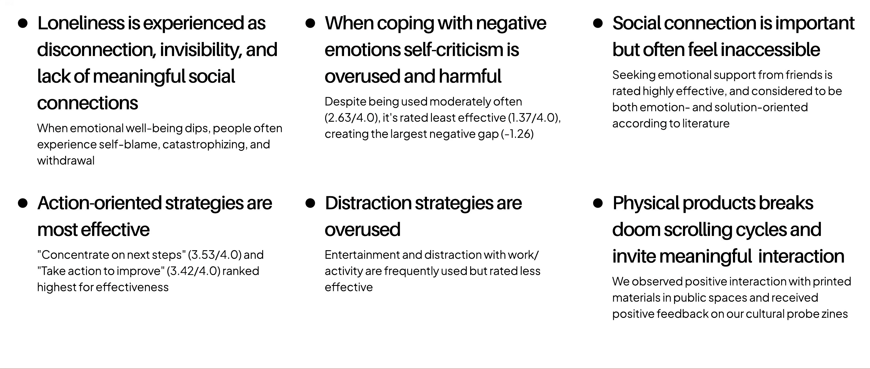
Results from our survey of 21 participants were consistent with our literature review and revealed a significant gap between knowing effective coping strategies and actually using them. That gap — between knowledge and action — became the problem we designed for.
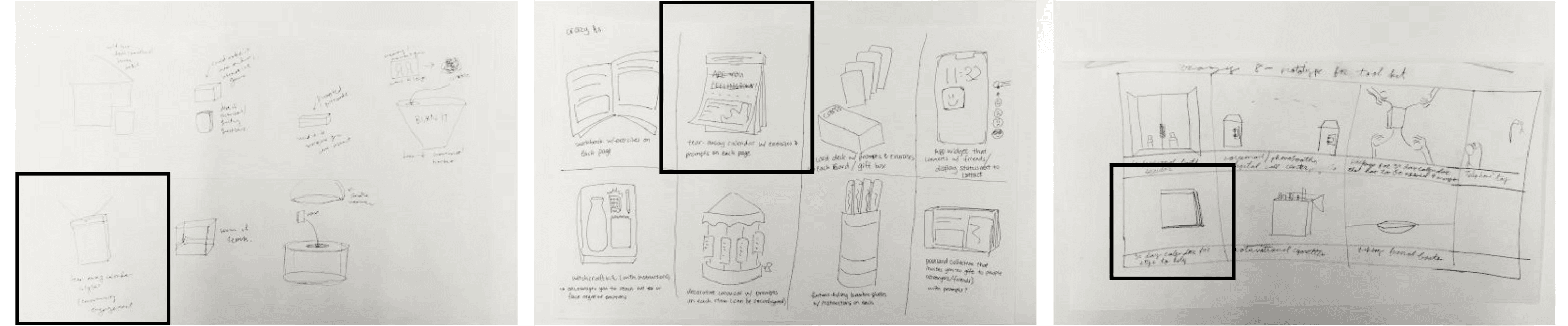
From storyboards to a tear-away booklet inspired by daily desk calendars
Storyboards and Crazy 8s — each team member explored different forms before converging on a tear-away booklet format.
What
A 30-day tear-away workbook of actionable daily exercises grounded in our most effective coping strategies — one page per day, no skipping ahead, physical and screen-free.
How
Encourage social outreach, active solutions, and positive reframing. Discourage self-blame, distraction, and unhealthy isolation.
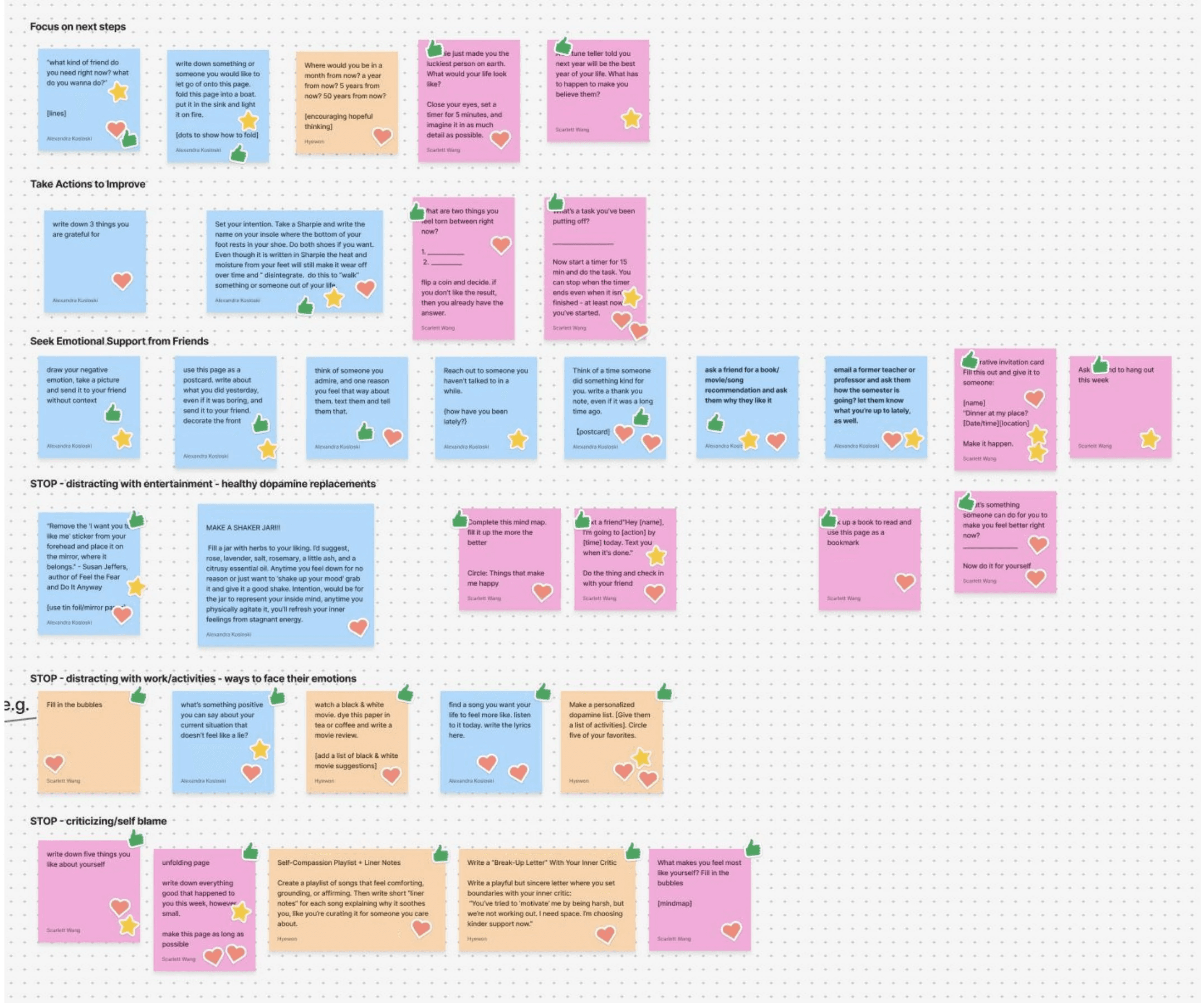
30 prompts, organized around six research-backed strategy categories
We brainstormed a large pool of prompts and selected the best 30 for each day of the month. We focused our design toward the most effective strategies, and against the most overused, harmful ones.
- Focus on next steps
- Take action to improve
- Seek emotional support
- Healthy dopamine replacements
- Ways to face emotions
- Stop self-criticizing
Testing color, binding, and clarity through iteration
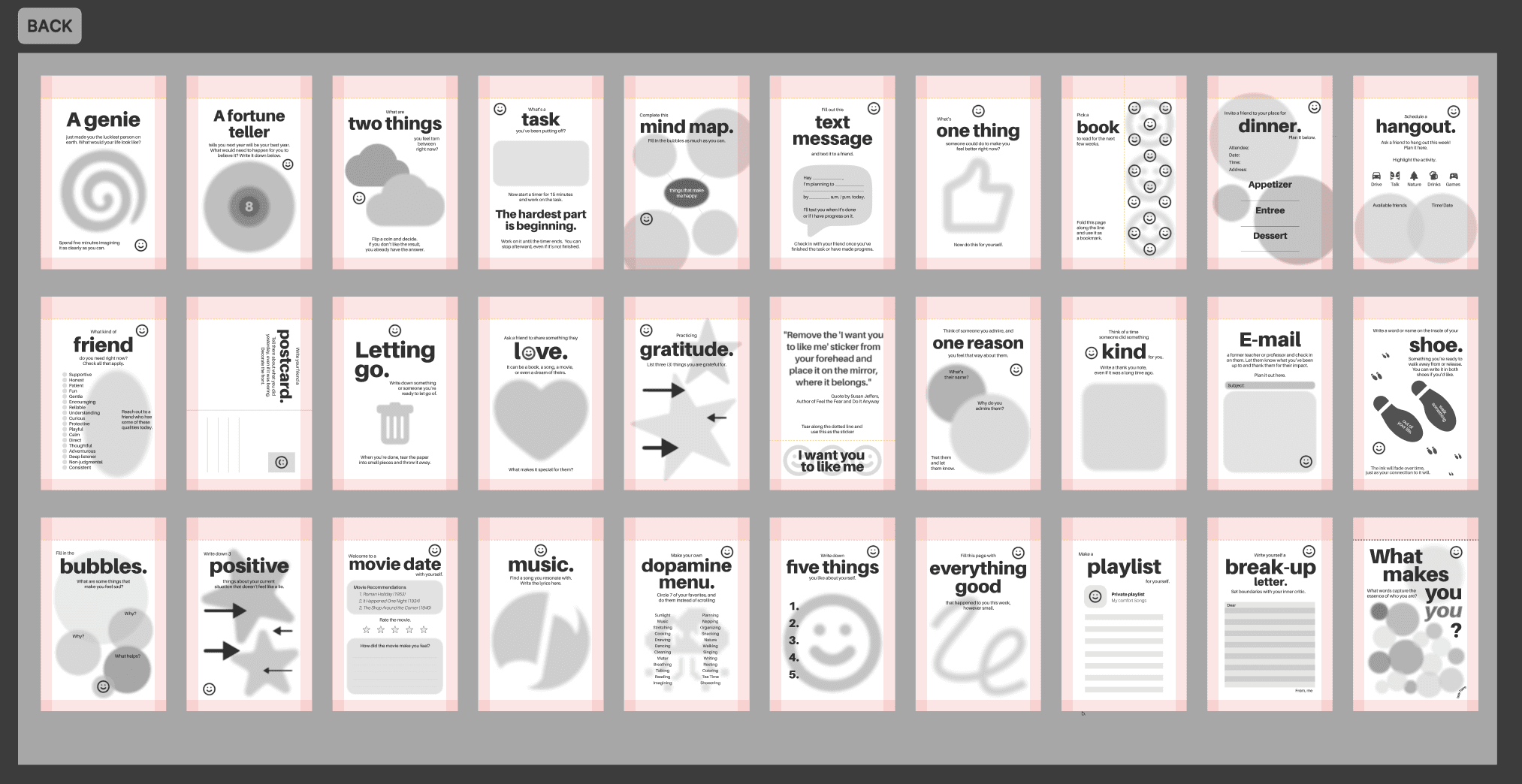
Page design v.1
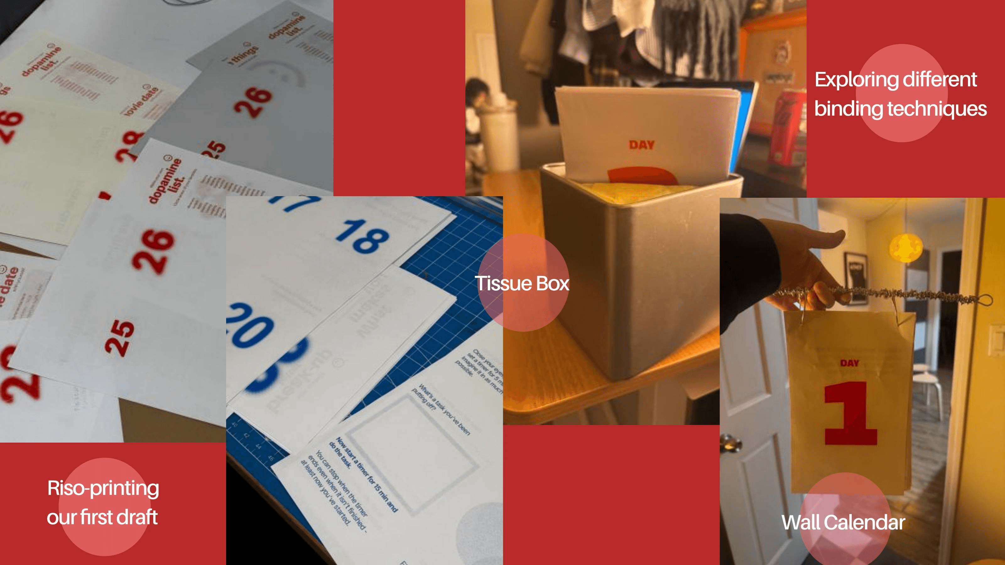
Each team member designed 10 cards individually to compare visual directions. Riso-printed in blue — which we quickly found felt too cold and clinical. We scrapped the palette and moved to red and yellow.
Binding exploration
We tested binder clips (too loose), staples alone (tore unevenly), wire rings (didn't invite tearing clearly), and wall calendar formats. A combination of staples, cardboard backing, and red tape proved the most reliable — clean tearing, sturdy hold.
User testing feedback
We rewrote ambiguous cards to be direct and immediately actionable, and simplified complex prompts so nothing required more effort than a bad day could afford.
Every material choice reinforced the emotional intent
Paper
Thick postcard-weight stock, durable for daily tearing. No transparency keeps the next card hidden, adding daily novelty.
Binding
Tear-away calendar format so the daily rhythm is structural, not aspirational. Red tape top bind references notepads — ideas, drafts, beginnings.
Color
Red and yellow as a sunrise palette — daily renewal, warm activation. Rejects muted wellness aesthetics; signals that emotional health is urgent.
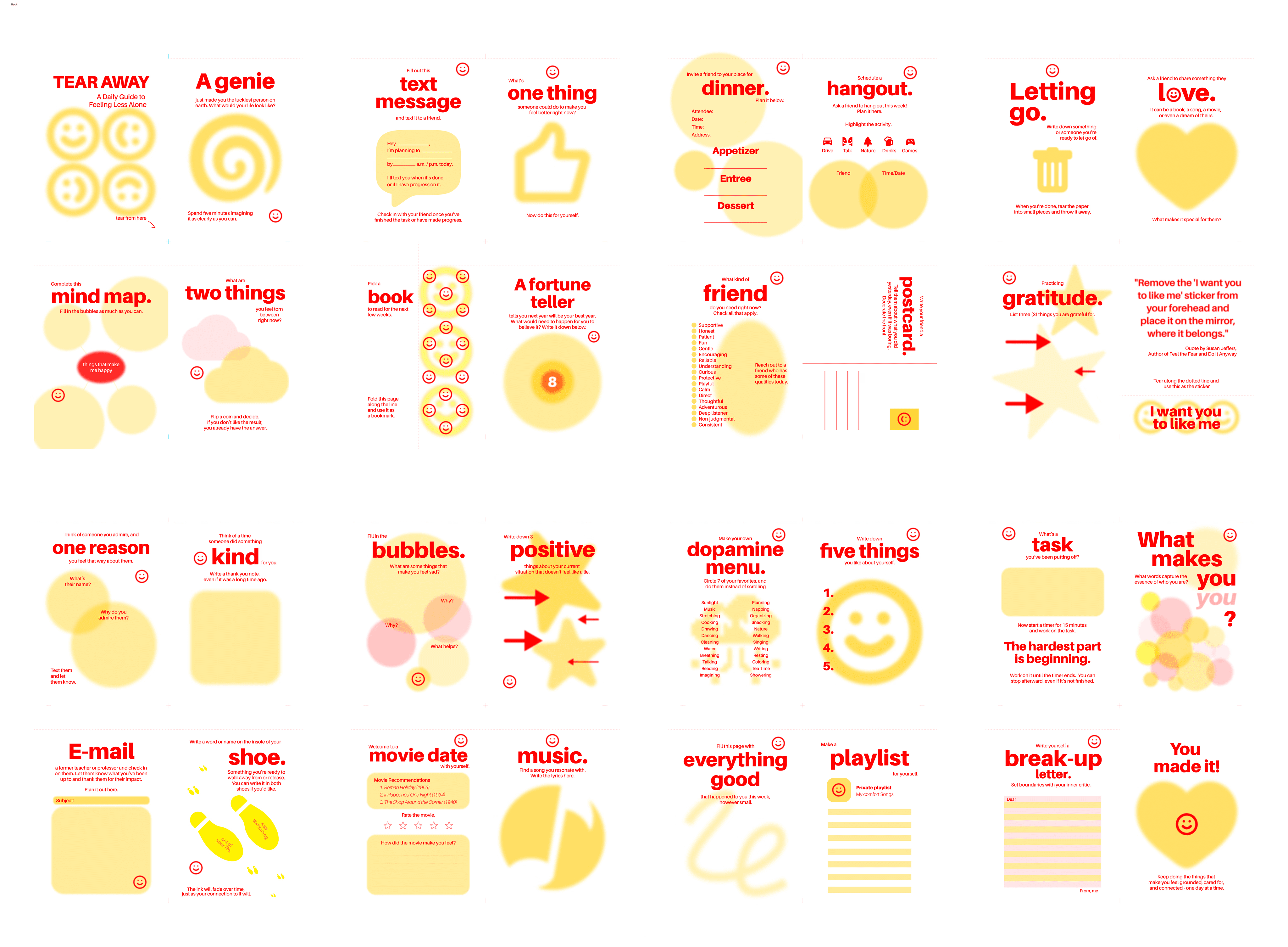
All 30 cards, each with a unique visual treatment
What I'd do differently, and what I'll carry forward
Things we'd do differently
- Test in community settings. We designed for cafés, bookstores, and laundromats, but never installed the product there — stranger interactions would change the design.
- Develop a scalable production process earlier. Binding at scale exposed how much we didn't know about physical production.
Things I'll carry forward
- Research shapes behavior, not just content. Our coping data told us how hard each prompt was allowed to be — activation energy constraints came from the research, not intuition.
- Tone is a clinical decision. Choosing bold red over soft blue, "vent" over "reflect," smileys over abstract icons — all attempts to remove the shame barrier from emotional self-care.