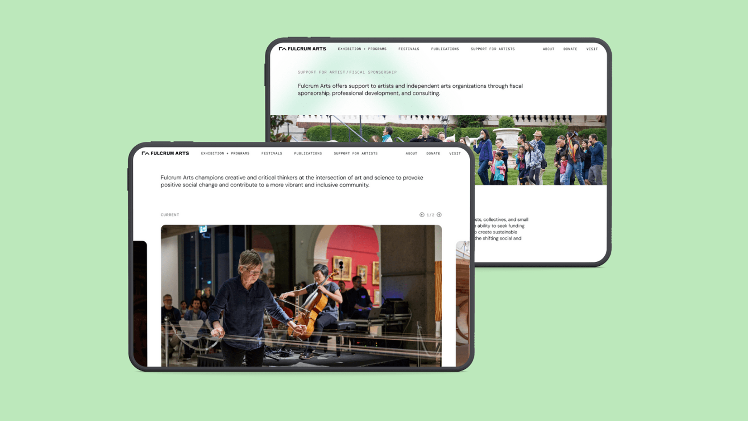
Communicating organizational identity through a website redesign
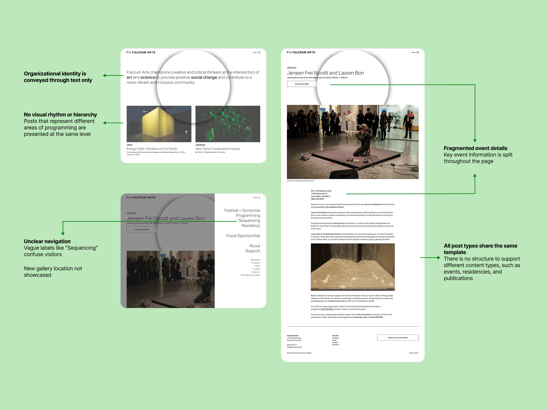
Fulcrum Arts does a lot — but the website didn't make that clear
As a nonprofit running exhibitions, festivals, artist residencies, publications, and fiscal sponsorship programs, Fulcrum Arts needed their main public platform to clearly communicate their multifaceted mission. Instead, the site left visitors confused about what the organization actually does.
Aligning on identity and message, before touching the design
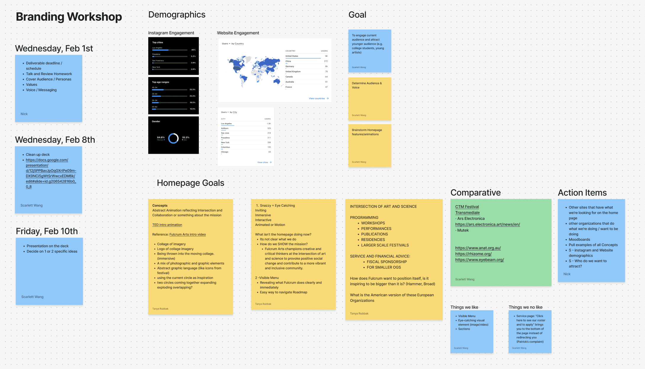
Before diving into the redesign, I facilitated workshops with the full team to align on organizational identity and messaging.
- Analyzed our audience — who we currently reach vs. who we want to reach
- Audited our language — how we describe each program and why it aligns with our mission
- Gathered inspiration — studied effective websites of art and cultural organizations to understand what makes organizational storytelling work
Outcome: a clear messaging framework and shared vision for the redesign.
Restructuring navigation into clear, logical categories
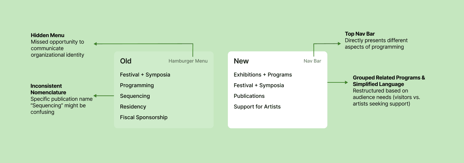
Working with the creative director and PR consultant, I restructured the site navigation to create clear, logical, and user-friendly categories that reflected the org's full range of programs without overwhelming visitors.
From visual system to interactive prototype
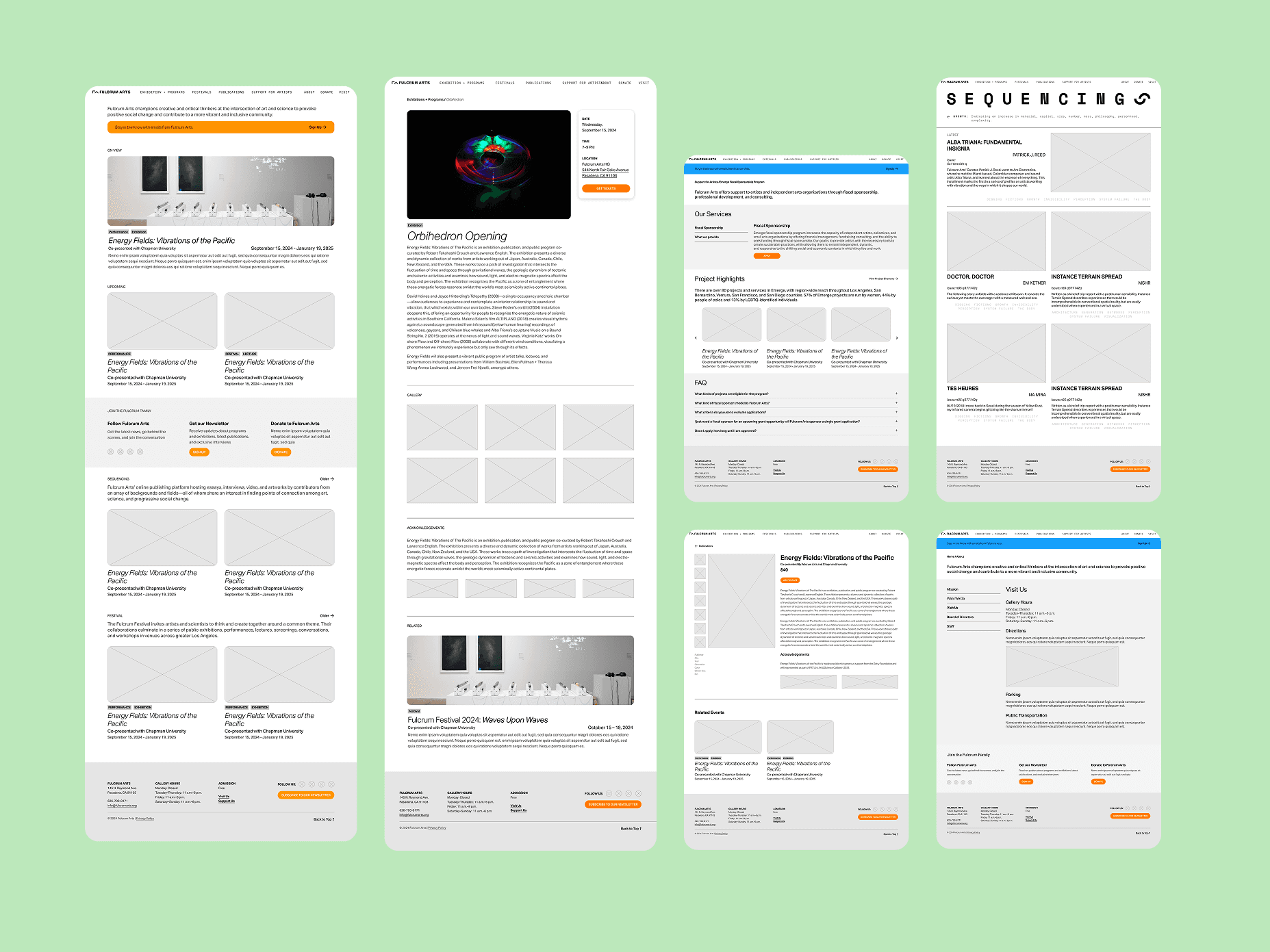
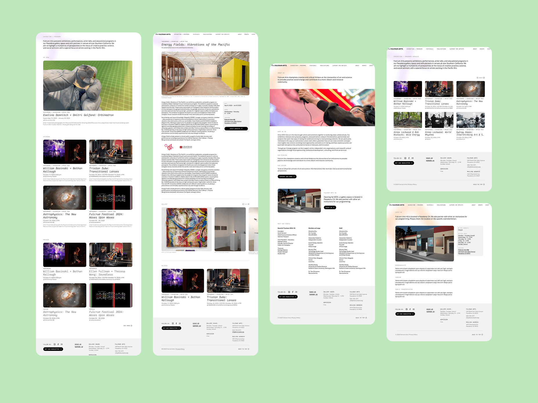
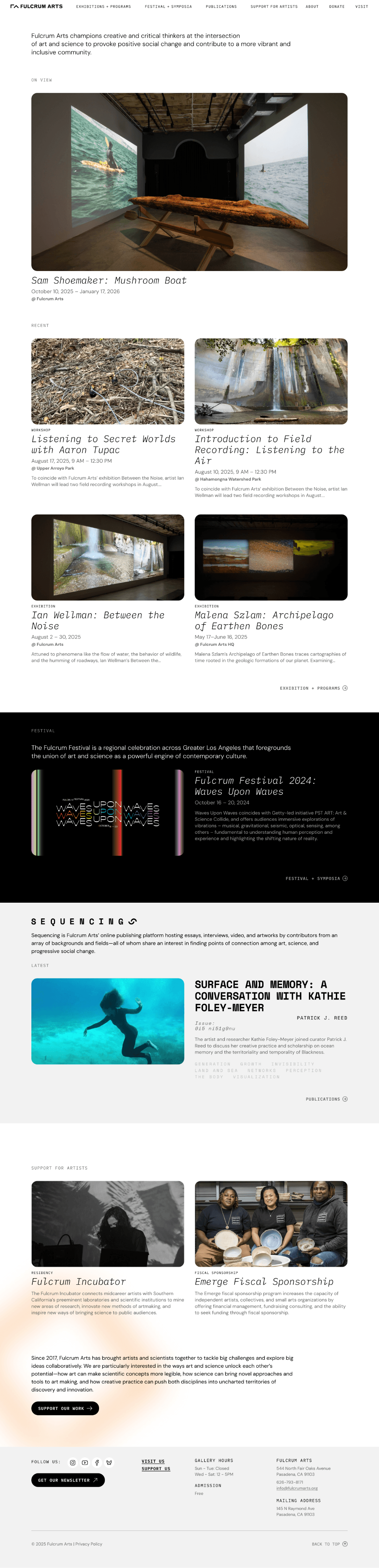
I collaborated with a graphic designer to develop a visual system, then translated it into website designs — starting with wireframes and building up to interactive prototypes. After presenting to stakeholders, I iterated based on their feedback to ensure the final designs served both organizational goals and user needs.
Managing handoff and quality assurance to protect the vision through launch
I managed the handoff to our WordPress developer and led testing to ensure the final site matched our design vision, using Notion to track all outstanding tasks.
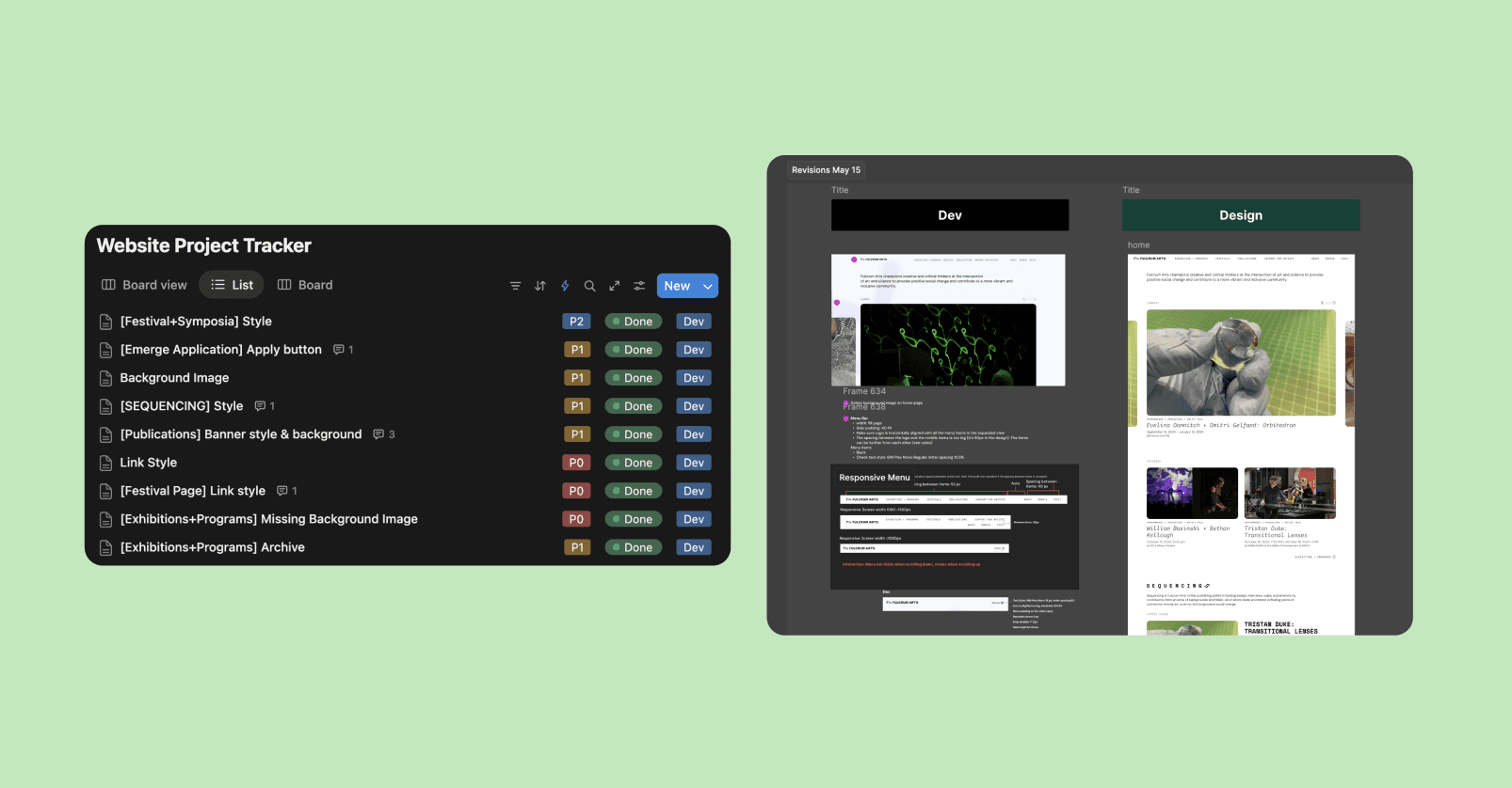
- Testing all pages and interactions
- Cross-checking with design and fine-tuning UI inconsistencies
- Coordinating review sessions with the curatorial team
- Documenting and communicating necessary adjustments
- Approving final launch
Design is as much about people as the product
Coordinating between PR consultants, graphic designers, curators, and leadership taught me that keeping everyone aligned is actual design work. Clear documentation and regular check-ins were essential to maintaining a coherent vision across diverse perspectives.
Content comes before visuals
I thought the hard work would be in wireframes and prototypes, but the most important decisions happened in the early workshops. Clarifying our organizational narrative and content strategy directed how every later design decision was made.
Storytelling needs accessible language
Sophisticated language doesn't always lead to clear communication. Curatorial texts, while intellectually rich, could alienate visitors unfamiliar with academic writing. My role became one of translation — structuring and visualizing complex information so it could be intuitively understood.