Tracing vibrational energy across the Pacific Rim
Contextualizing an academic curatorial theme for a general audience
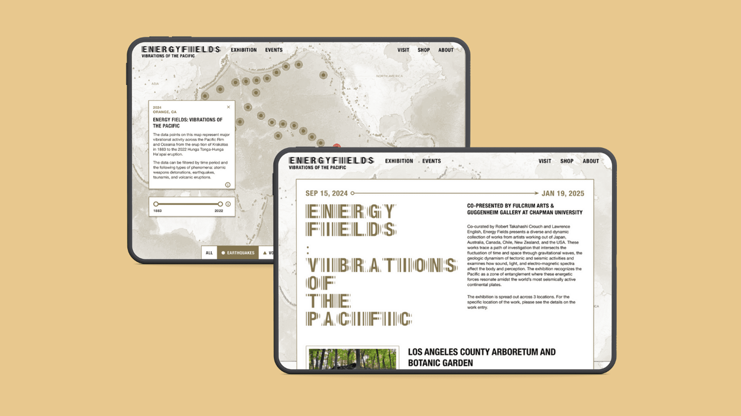
Energy Fields is an exhibition, publication, and series of public programs exploring time, space, and energy through gravitational waves, tectonic activity, and sensory phenomena. To support and promote the project, I designed its website — contextualizing the curatorial theme, presenting the works, and guiding the audience through each line of inquiry into different vibrational energies.
Turning an academic dataset into something visitors could explore at their own pace
As Digital Media + Marketing Coordinator, I recognized the exhibition's academic and theoretical nature and the need to make its themes accessible to the general public. Collaborating with the curators, we decided to present the Pacific Rim's vibrational activities — earthquakes, tsunamis, volcanic eruptions, and weapon testing — through data visualization on an interactive map.
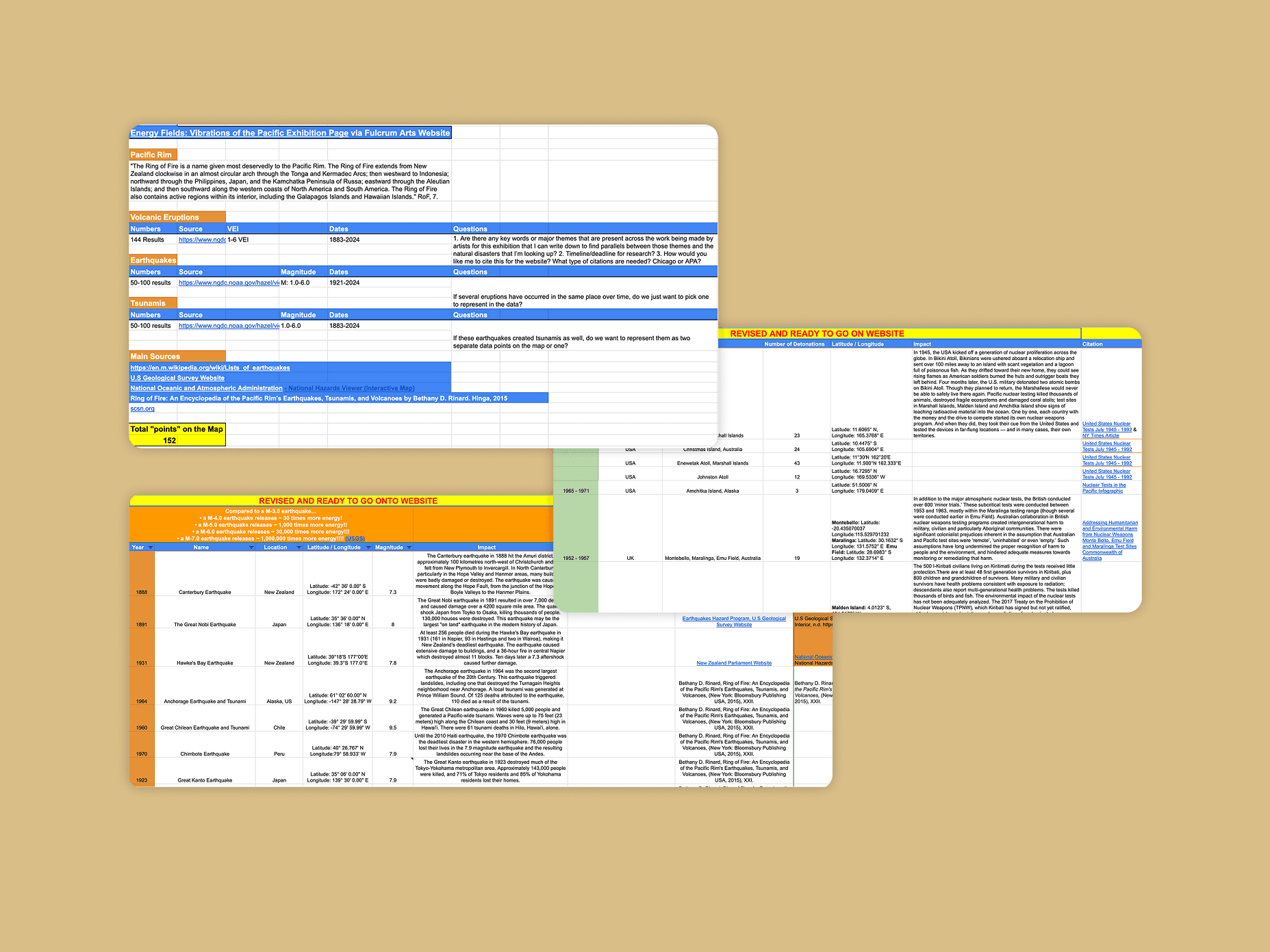
Working with a researcher, we refined the large dataset down to 152 significant events representing major vibrational activity across the Pacific Rim and Oceania, from the eruption of Krakatoa in 1883 to the 2022 Hunga Tonga–Hunga Ha'apai eruption. We structured the information into key fields — year, location, magnitude, and impact — forming the foundation of the visualization.
Building on the catalog's visual language, adapted for accessibility on the web
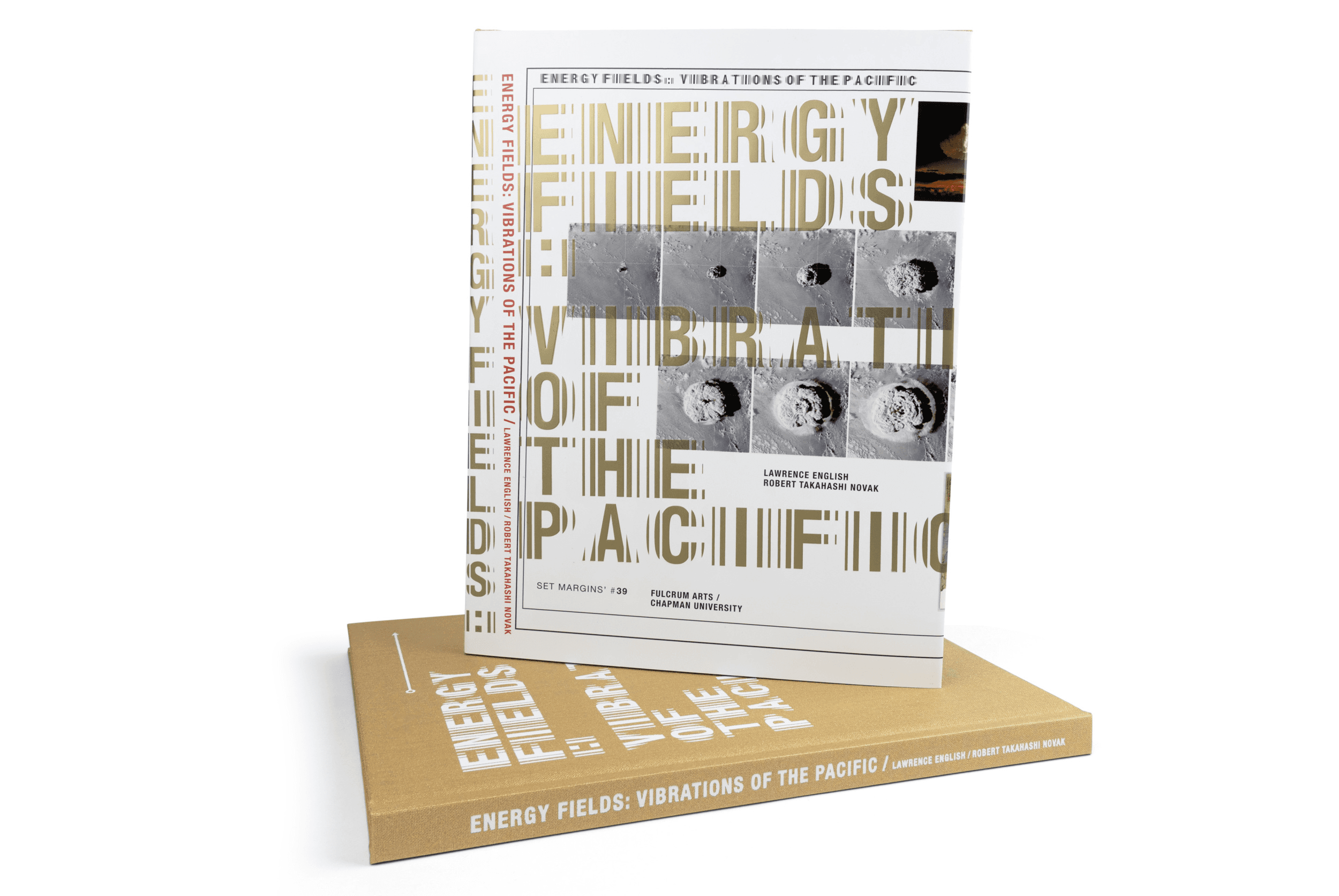
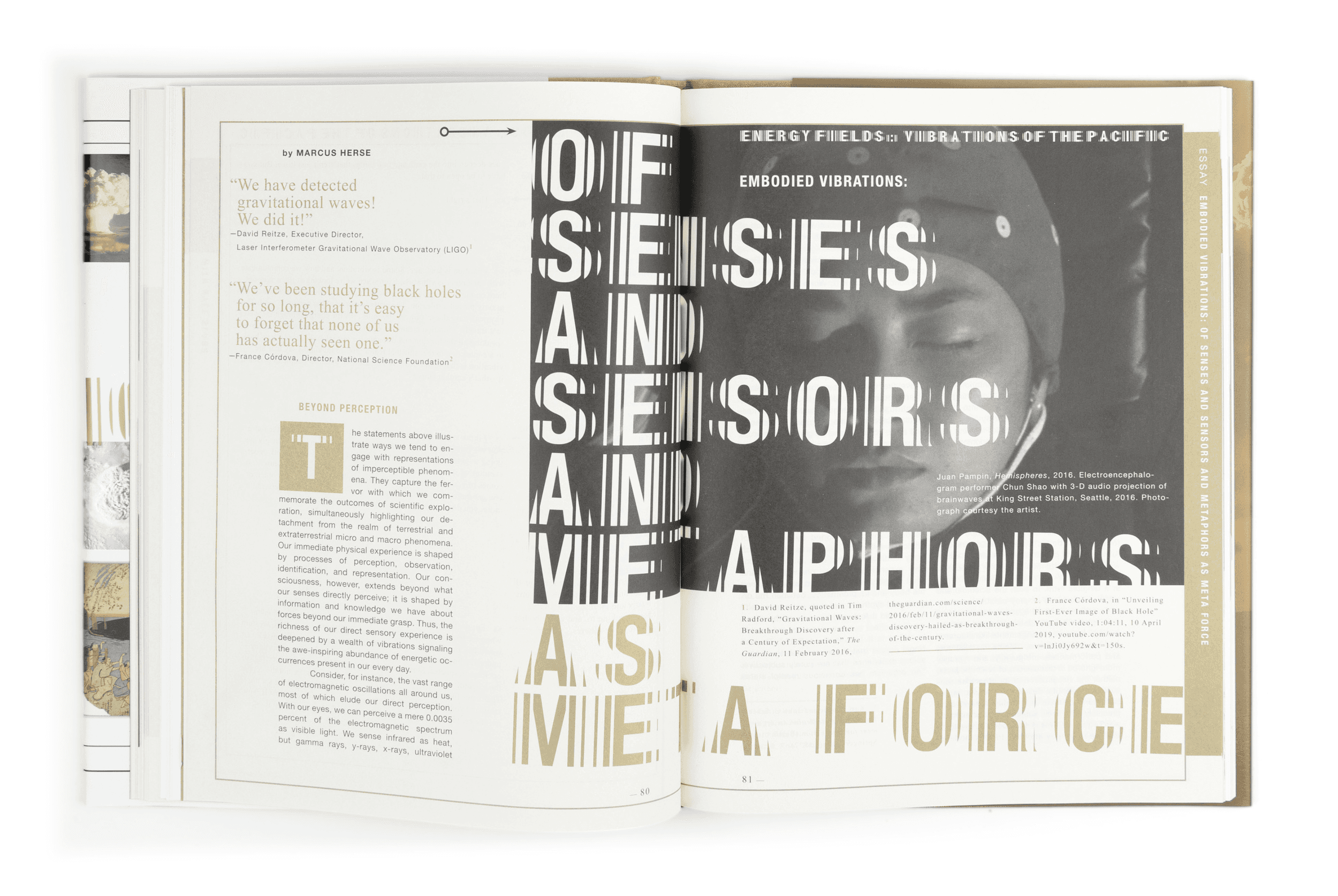
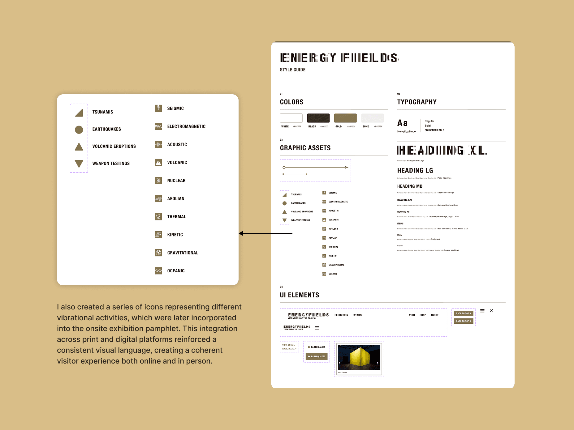
Prior to the web project, the curators had commissioned a catalog design for the exhibition (publication design by Set Margin). To maintain visual coherence, I built upon this foundation, adapting its elements into a style guide for the website. While the publication was visually stunning, many of its choices posed accessibility challenges in a web format — the custom typeface, Vibration, was only legible at large sizes. In my designs, I used decorative elements sparingly, balancing aesthetics with readability for an accessible, intuitive experience.
An atlas-inspired map that lets visitors filter vibrational activity by year and type
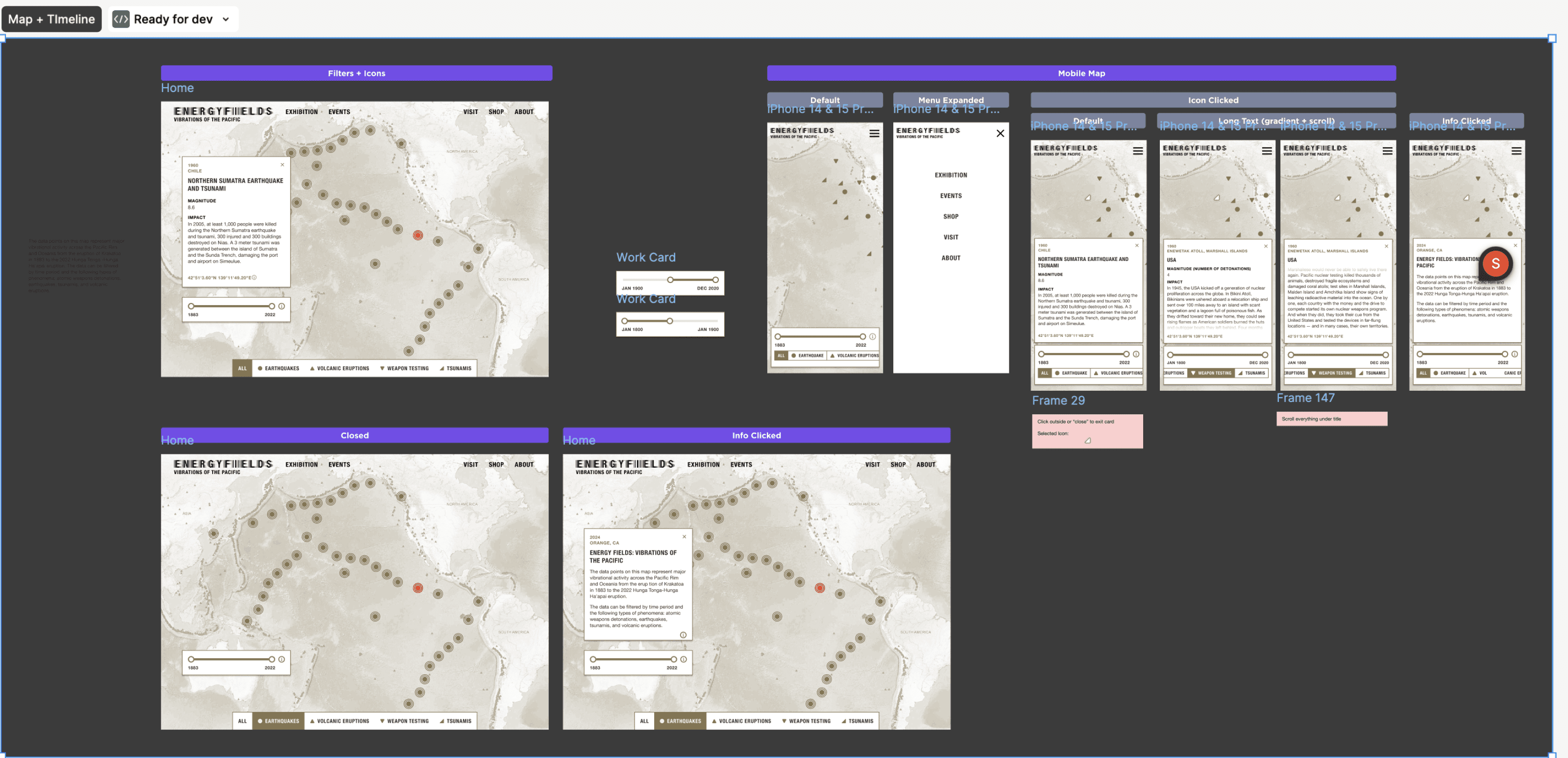
Through wireframing and prototyping, I developed the website layout and collaborated with the engineer to explore possibilities for data mapping and visualization. We researched existing sites with interactive maps, such as Queer Maps, to assess feasible design and engineering solutions within our timeline and technical capacity.
The final design merges elements from the catalog and website style guide, featuring a historical, atlas-inspired style for the Pacific Rim map. Users can filter events by year and type, visualizing vibrational activities across the region in an intuitive, engaging way.
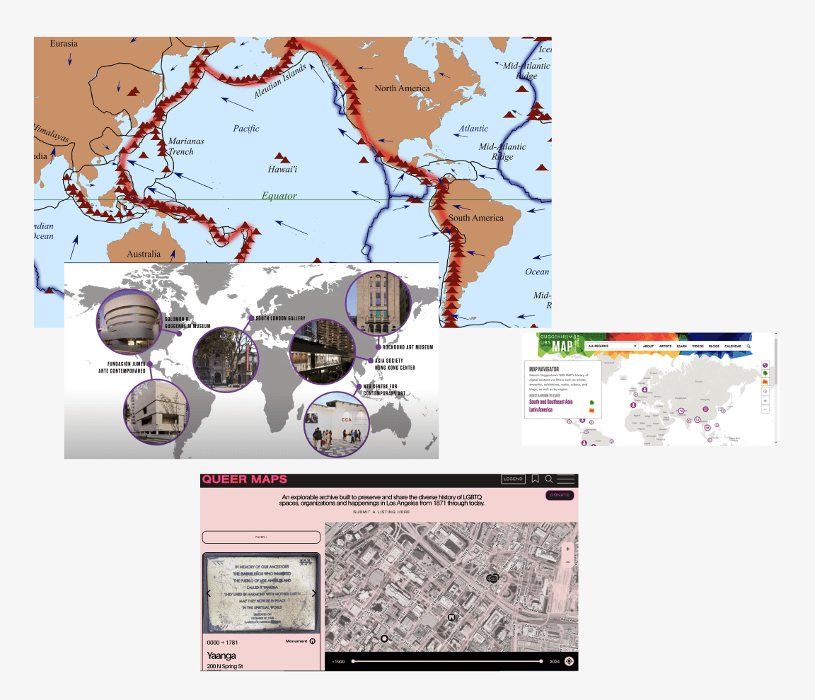
Data visualization references
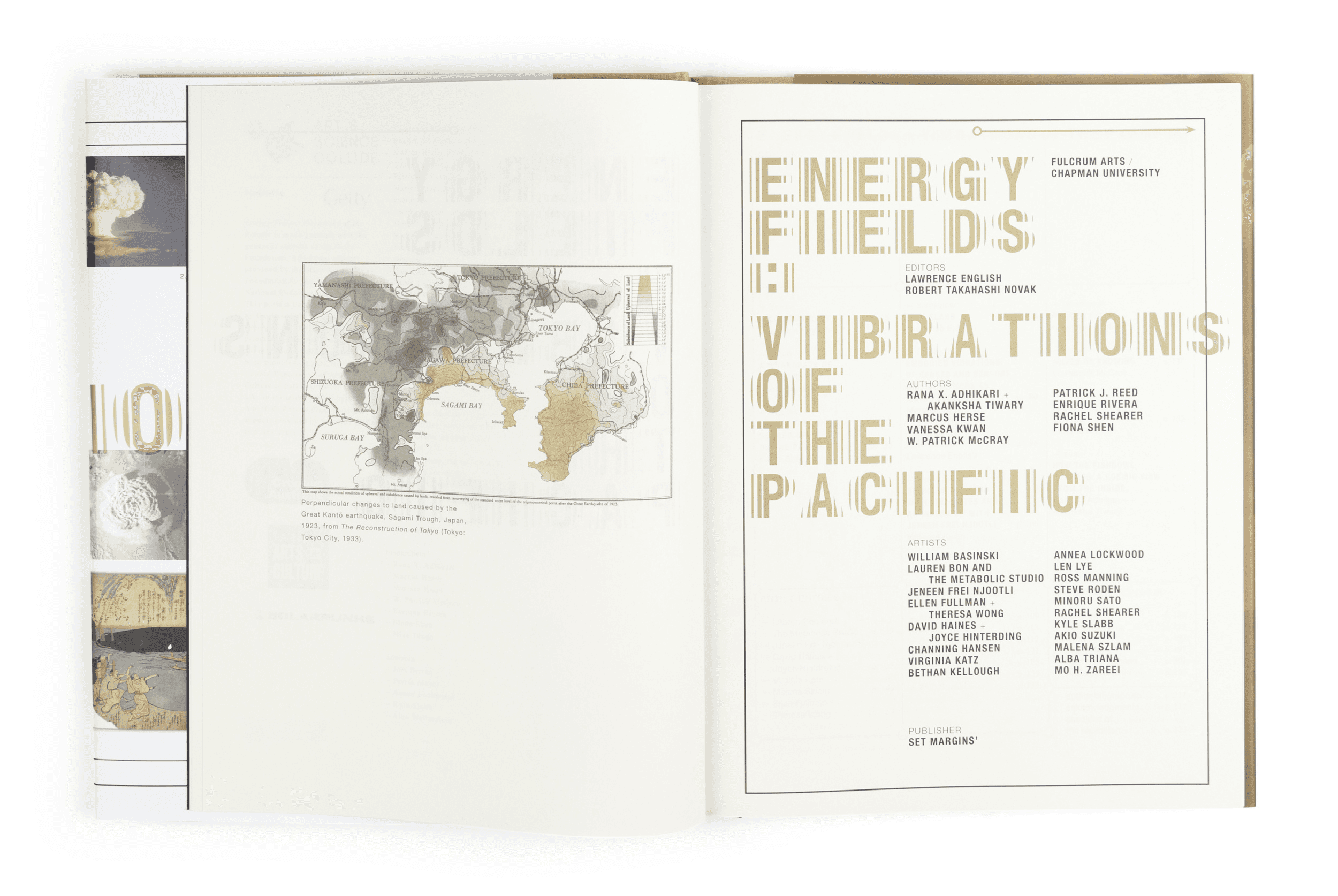
Publication design by Set Margin
A website that makes an academic exhibition feel explorable
The final site pairs the atlas-inspired map with clear, accessible writing — giving visitors a way to move through 140 years of vibrational history at their own pace.