Translating a brand refresh into an e-commerce storefront
I spent the summer designing for FURI, a Brooklyn-based tennis brand making the sport more inclusive and accessible. As a solo designer with no engineer on the team, I scoped the work to what I could ship in 8 weeks: the brand refresh across the site, built as a Shopify system the founders can keep extending.
Problem
FURI refreshed its brand and is expanding from performance rackets into lifestyle, but its e-commerce site hasn’t caught up.
Outcome & Impact
14
Custom sections + page templates, built and handed off in a custom Shopify theme
100%
5/5 users surveyed rated the new site more usable and more on-brand
Role
Product Designer (Internship)
Timeline
June – August 2026
(8 weeks)
Team
Solo designer, reporting to Co-Founder / Chief Brand Officer
Tools
Figma, Shopify, Claude Code, Liquid, CSS
Final home page design (mobile)
Final product page design (mobile)
Understanding the goal and the gap
The site is both the business card and storefront
FURI is expanding from performance rackets into lifestyle and streetwear to expand their customer base. At the same time, it needs to attract investors.
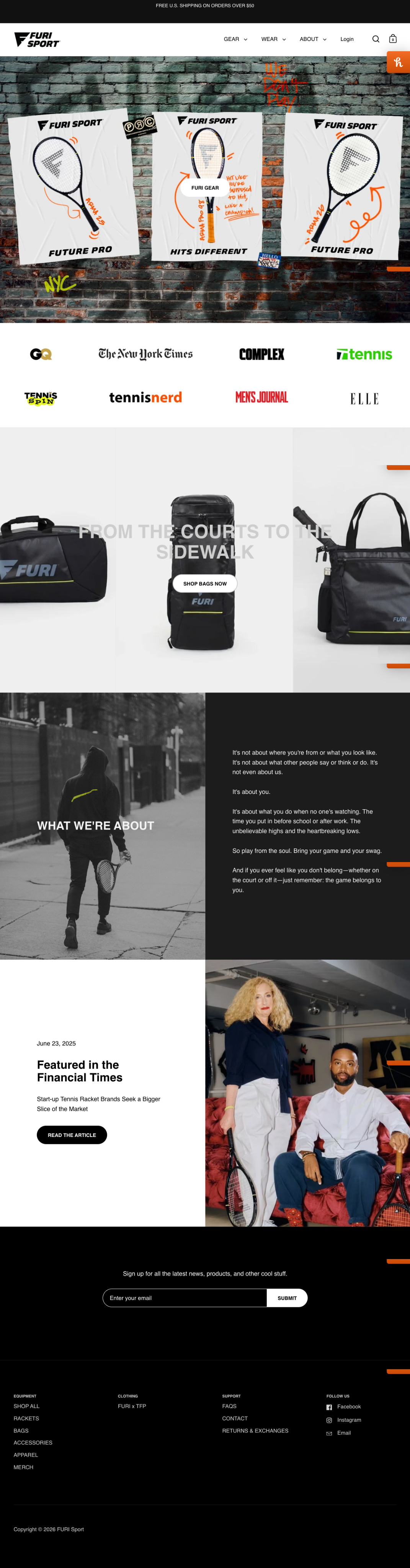
Loud, unapologetic, New York
The site has to break the preppy, exclusive image of tennis. The brand book suggests bold typography, photography, and a grid system resembling a tennis court.
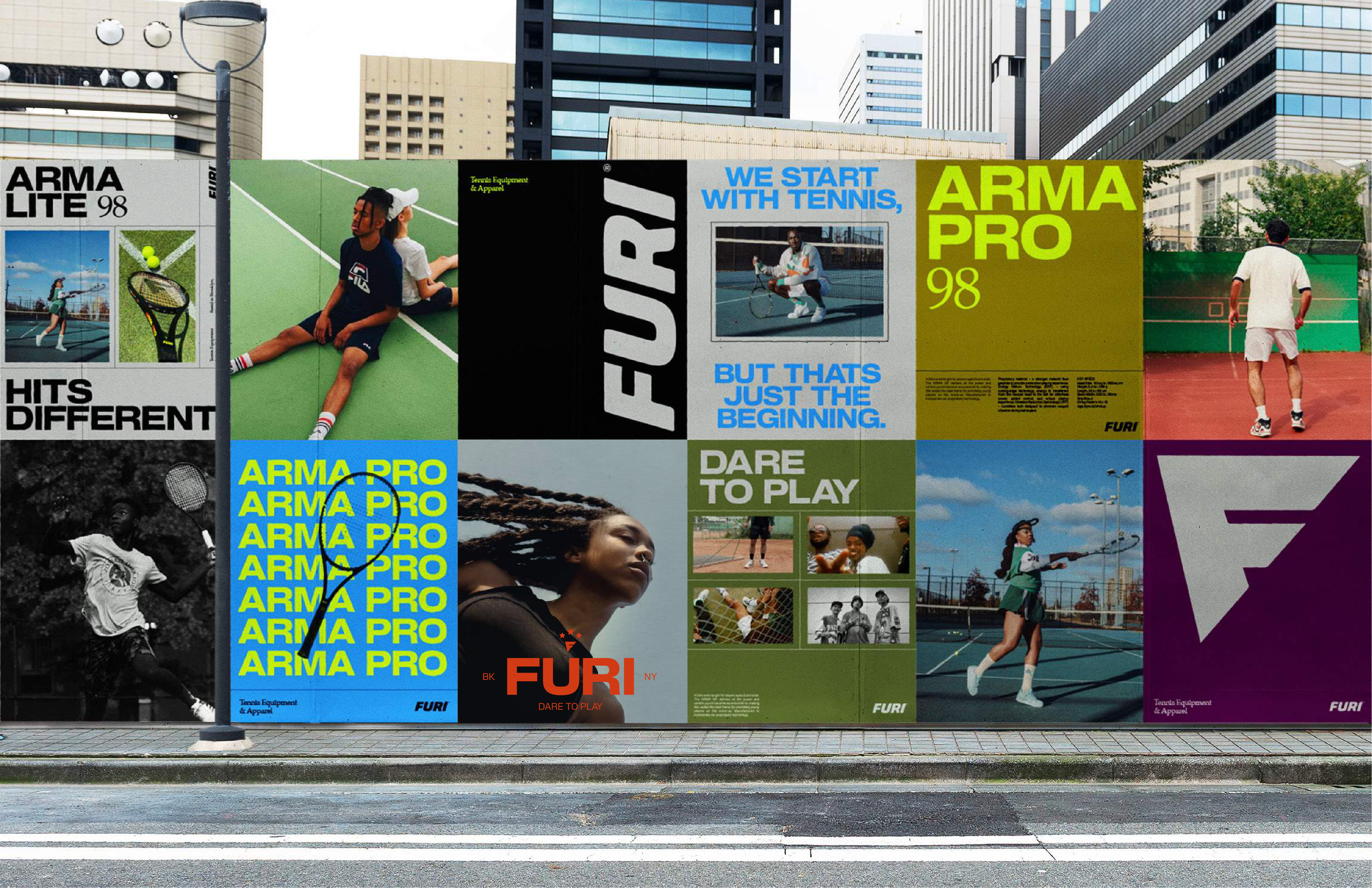
Gap: the current site doesn’t reflect brand identity or communicate product differentiation
The site needs to leave an impression with better visual storytelling and information hierarchy.
How might we design a site that impresses and converts?
I researched sports/lifestyle brands that balance strong editorial identity with a smooth path to purchase.
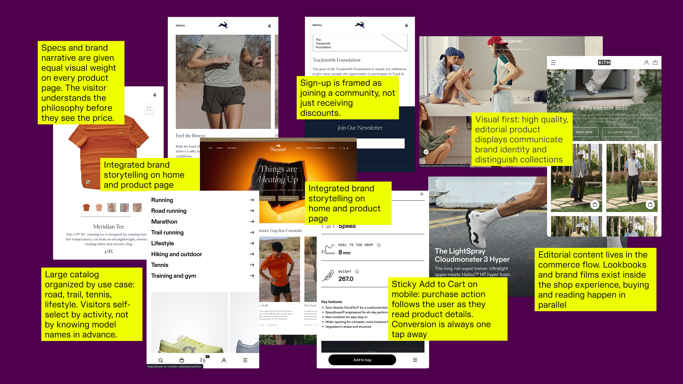
Competitive analysis
Mapping the site and building it out of reusable pieces
FURI is early and will grow into more product lines, content, and events. Considering the timeline, I prioritized a system over page-by-page polish: templates that take real content later, instead of static screens designed around what existed at the time.
I restructured the sitemap around Shop, Collections, Product, and The Brand, then wireframed the key screens mobile-first. I tested the flow with 3 users before finalizing the wireframes.
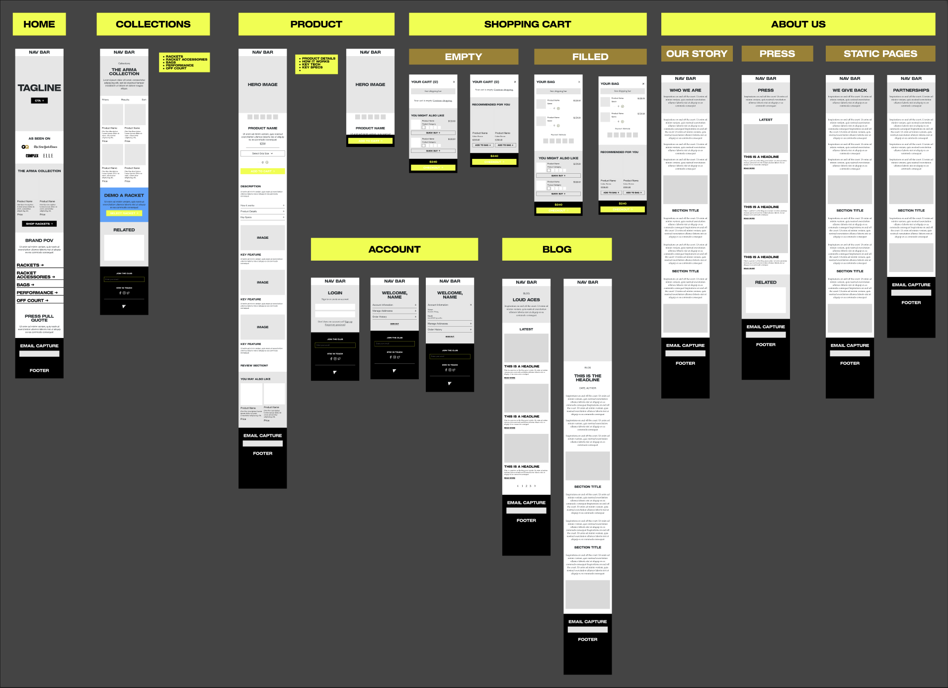
Wireframes + lo-fi design
Founder feedback
“Too safe — it looks like every other e-commerce website”
As I presented the lo-fi designs, the co-founder expressed that the layout looks too safe and generic. FURI wanted bold design choices to match the brand identity, so the question as I moved onto hi-fi became: how do I build on the existing brand book to create a unique, memorable web experience?
Communicating brand identity through bold UI choices
I translated the brand book into a design system on Figma to ensure consistent design across web and mobile. I also designed custom icons, controls, and components to match FURI’s new brand identity.
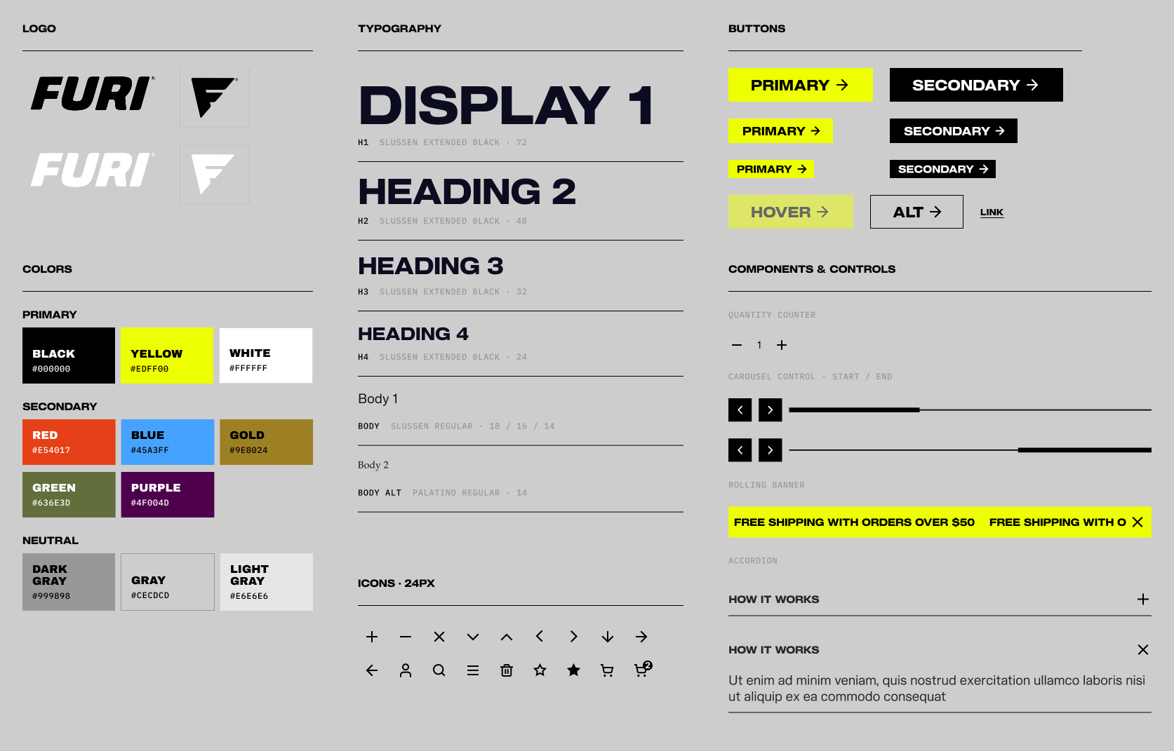
Design system
The founder specifically wanted a floating nav bar covering a third of the screen, referencing koppen.co. I took this as an opportunity to integrate the tennis court-inspired grid structure from the brand book.
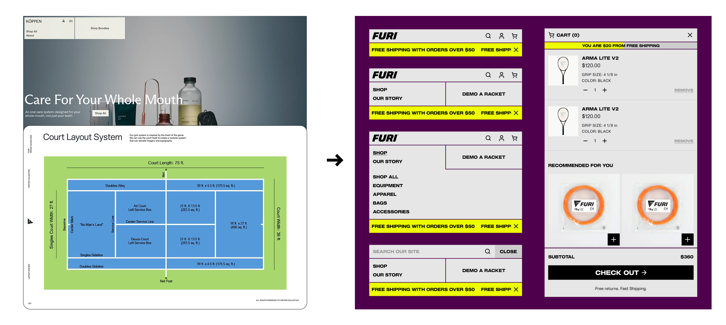
Floating nav in action
Applying the design as a system: floating elements span 1/3 screen
It’s easy for the element to fight the rest of the page, so I made it a module: 4 of 12 columns. The filter panel and checkout drawer use the same width and float the same way, so the experience feels coherent.
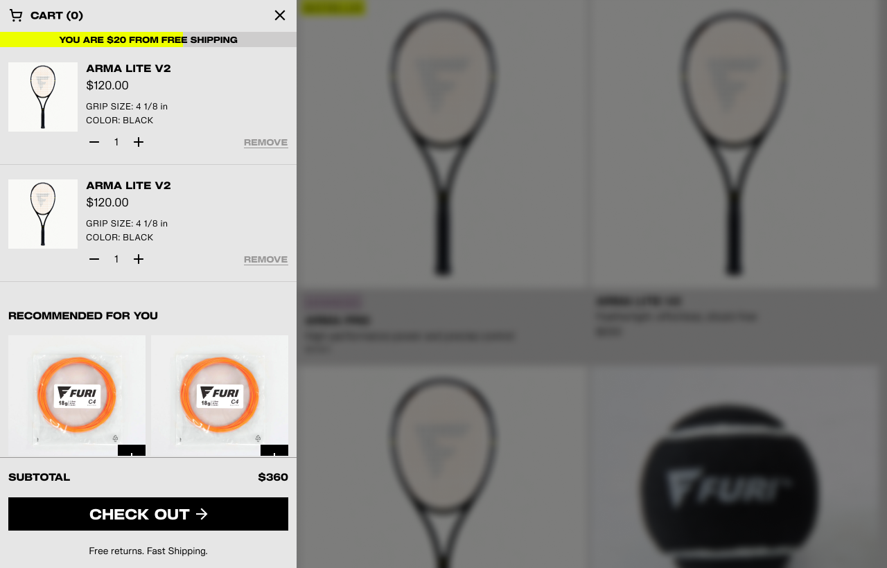
Cart slides in at the same width
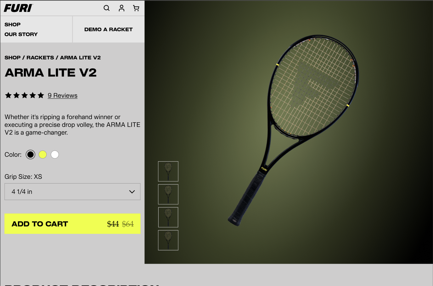
Product image in full, unblocked view
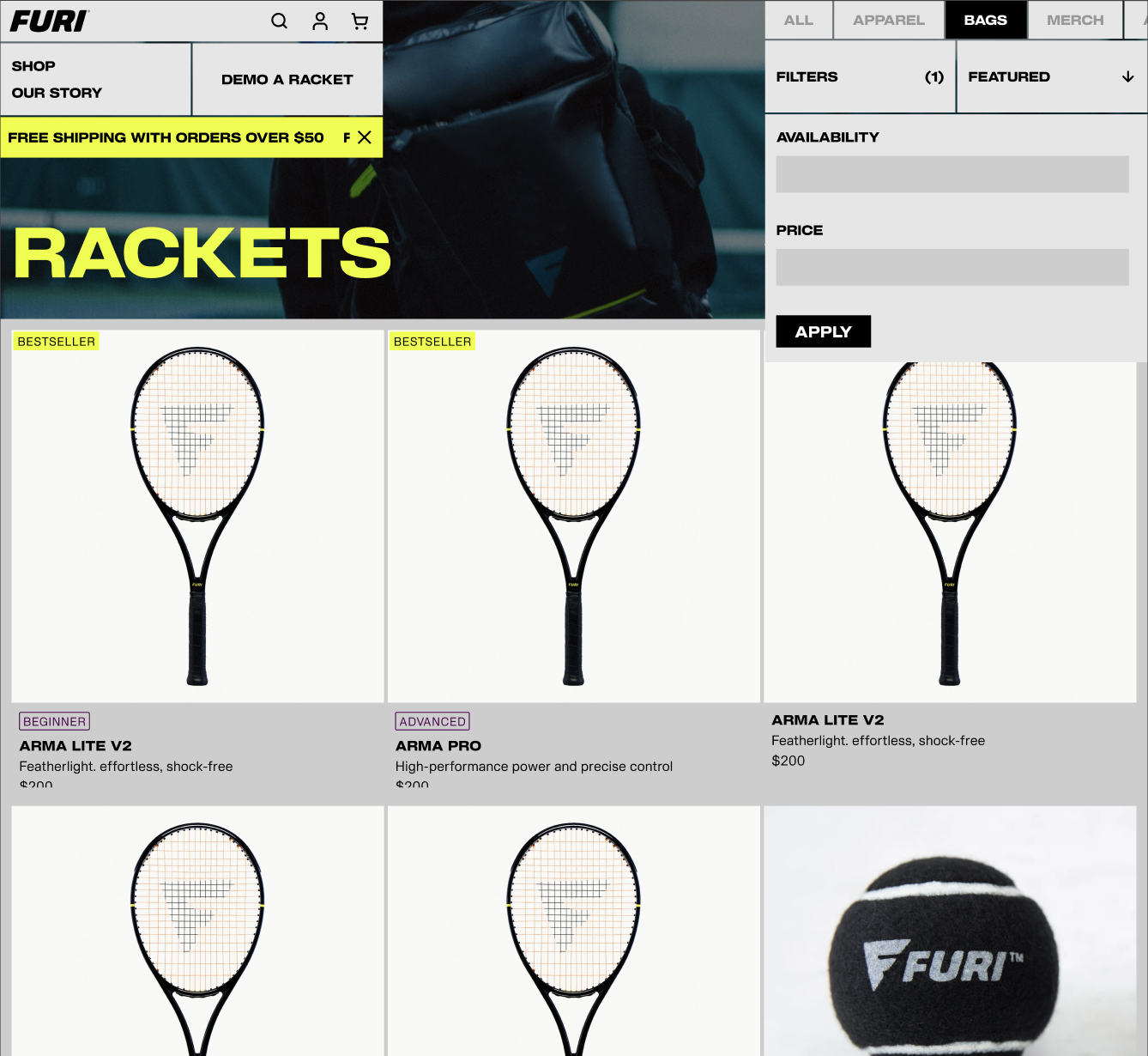
Shop filters open in the same width
PDP, hi-fi design, Figma prototype
Hi-fi page designs
Beyond the nav, I designed each page template in full, from the home page to the blog and static pages, each with a mobile version, so the founders launch with a complete, consistent site.
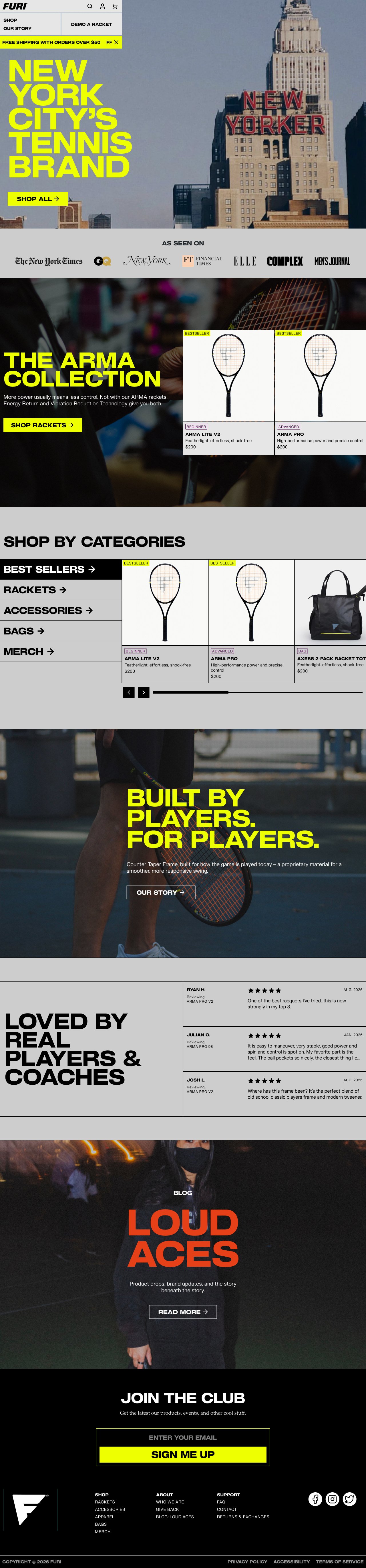
Home
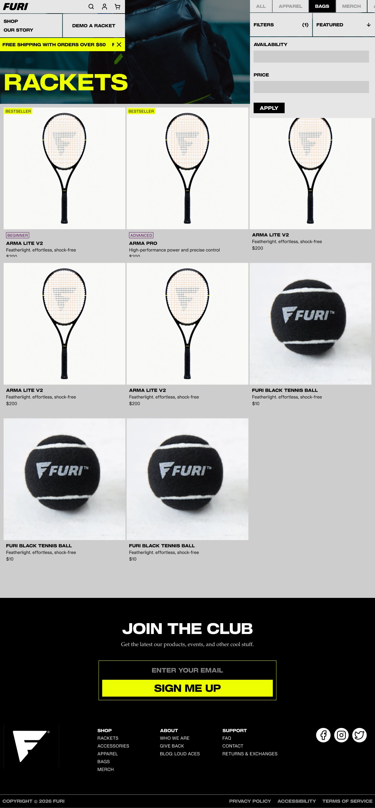
Shop
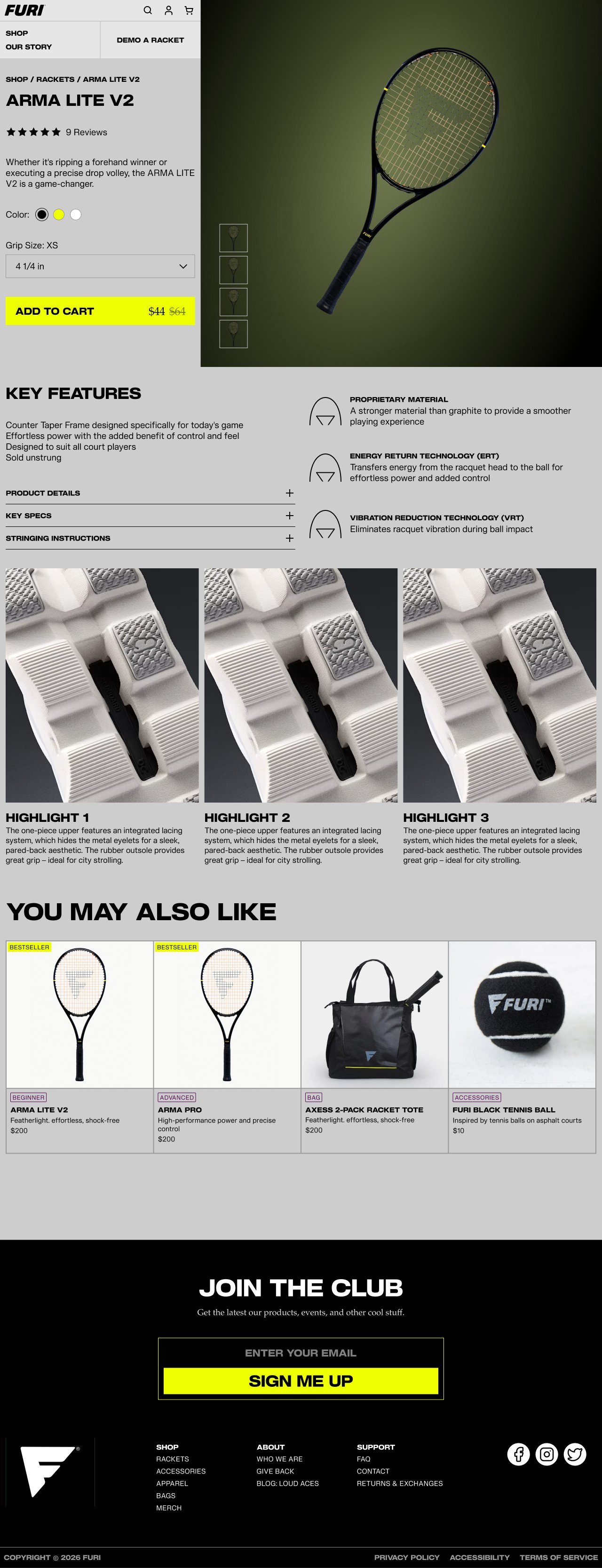
Product
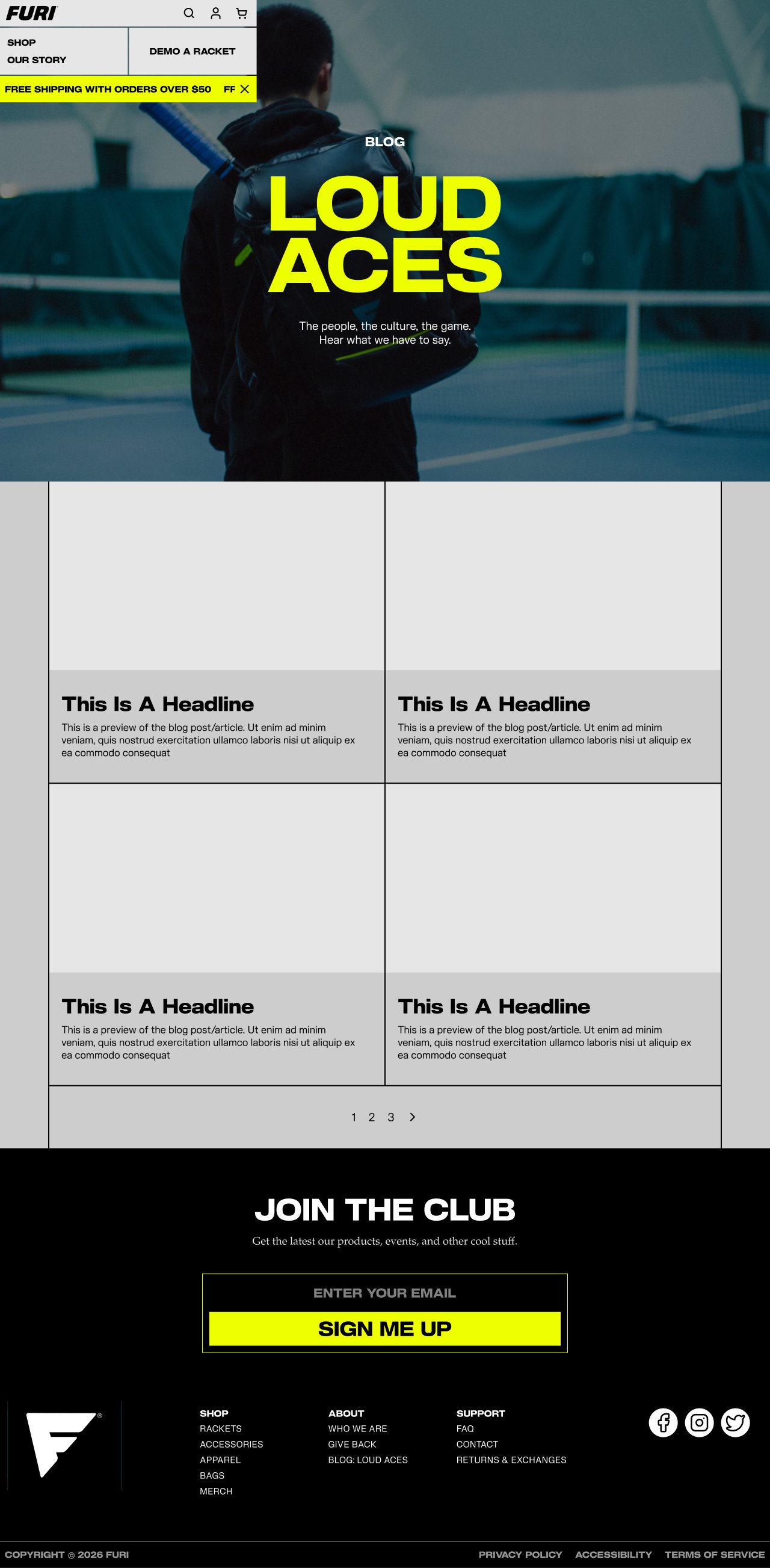
Blog
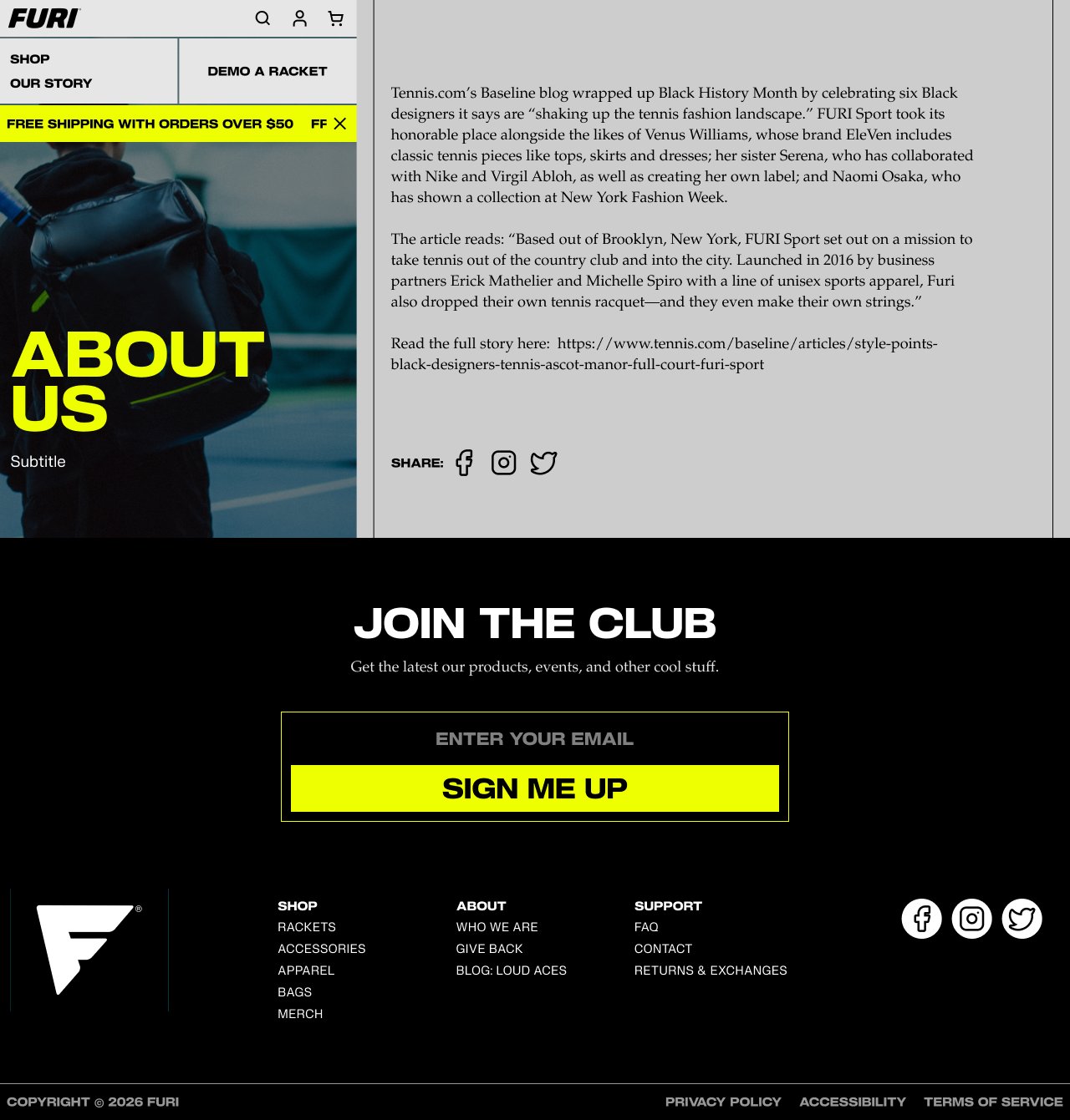
Static page
Building it in Shopify
With no engineer on the team, I rebuilt each component as a configurable Shopify section in Liquid using Claude Code. Templates ship with placeholders, so the founders can add products, posts, and events without a developer.
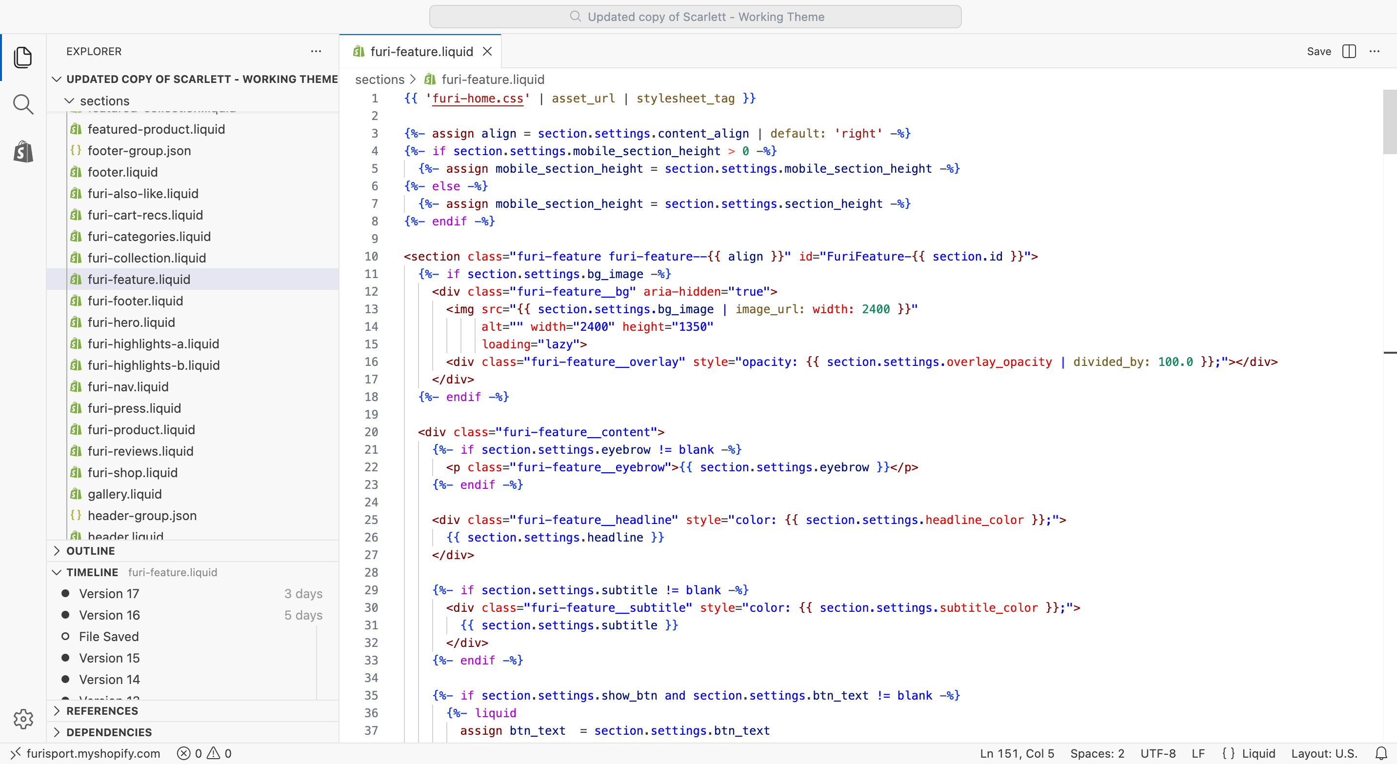
Shopify / Liquid
6 page templates and custom snippets
Home, shop, collection, product, blog, and static pages; each component rebuilt as a configurable Shopify section
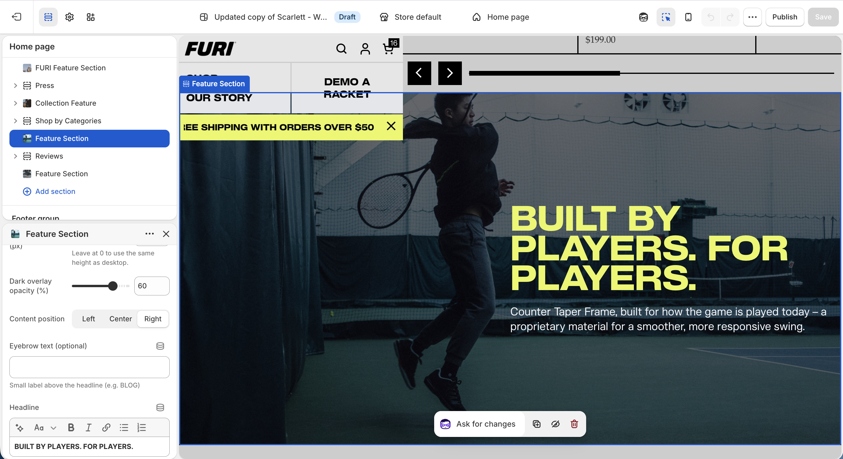
Theme editor
Founders and future web admin
Fill in and edit content without further development
A prioritized handoff
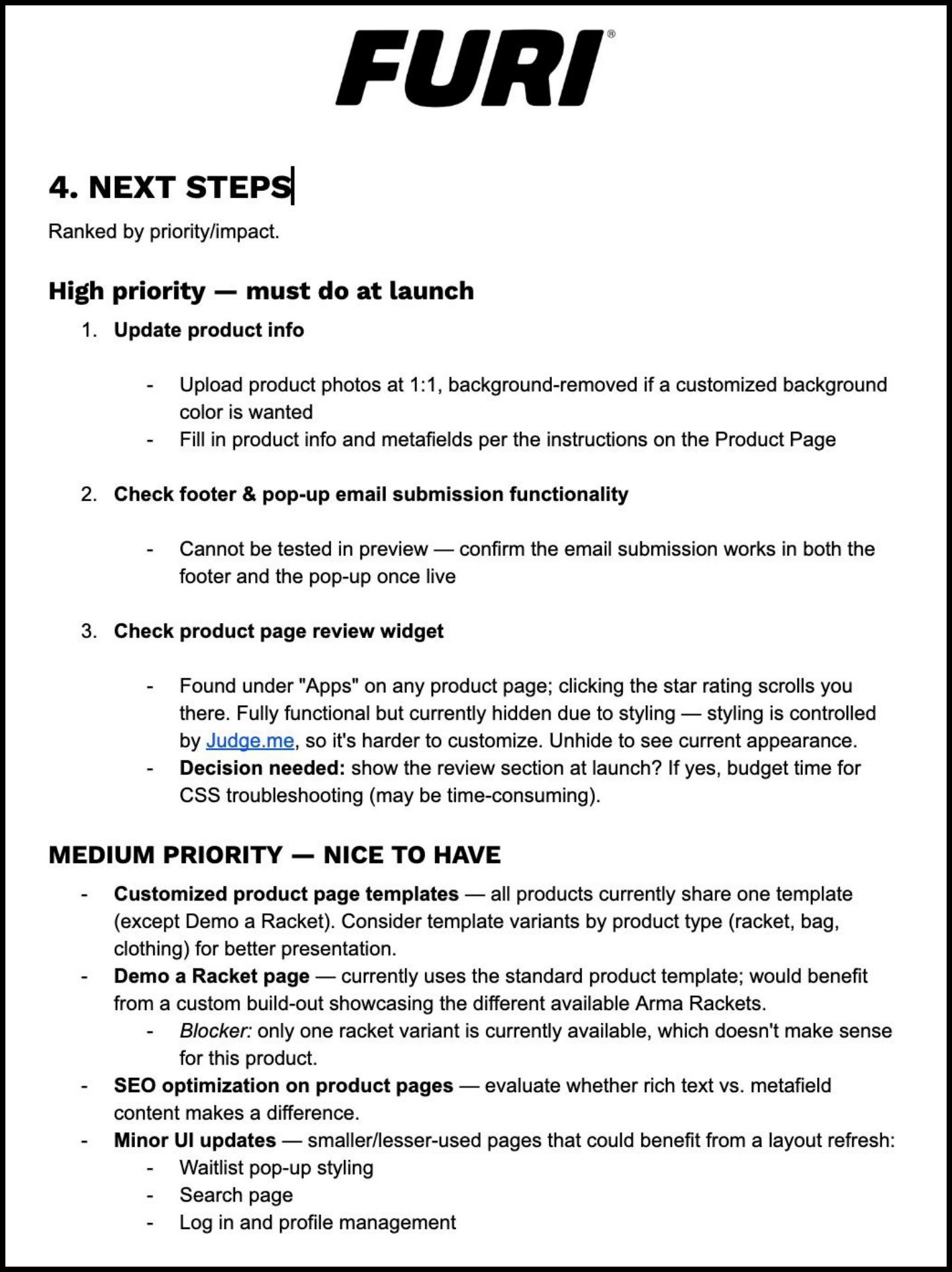
Product specs weren’t populated by the end of my internship, so I built the theme for the founders to add product content before launch. Alongside the theme, I wrote a handoff guide covering what’s been built, how the theme files are organized, how to update content without code, and next steps ranked by priority, including open decisions and blockers.
Admin work
- Enter product specs and descriptions on Shopify
- Test footer and pop-up email submissions
- Check product review widget integration
- Richer product page graphics
- Dedicated demo racket page (pending inventory decision)
- SEO for product pages
- Small UI and interaction polish
- Task-based usability testing
Shipped solo in 8 weeks
A design system from the brand book
Figma styles, custom icons, controls, and components that keep web and mobile consistent.
Every page, desktop and mobile
Home, shop, product, blog, and static pages, designed in full and tested with users.
A custom Shopify theme
14 custom sections and templates, built with Claude Code without an engineer.
A handoff the founders can run
Content updates need no code, and a handoff guide documents the build and what comes next.
What I learned
Designing for expanding and scaling content
FURI will add products, posts, and events after I leave, so rather than static pages, I designed templates and sections with future expansion in mind.
Prioritizing within a limited time frame
As the only designer with no engineer, I had to define an 8-week MVP: the brand refresh plus a Shopify system that works. Deeper UX testing didn’t fit the timeline, so I added it to the handoff roadmap.